Pirna and Iserlohn, Germany
www.rikomagic.de
Fonts in Use

Gedautal, Stolberg (Aachen, Rhld.), Germany
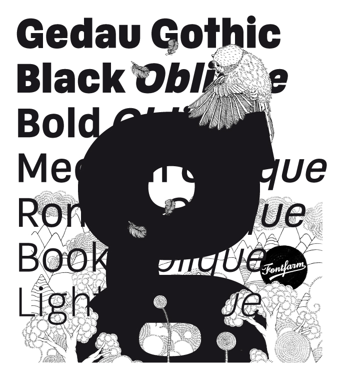
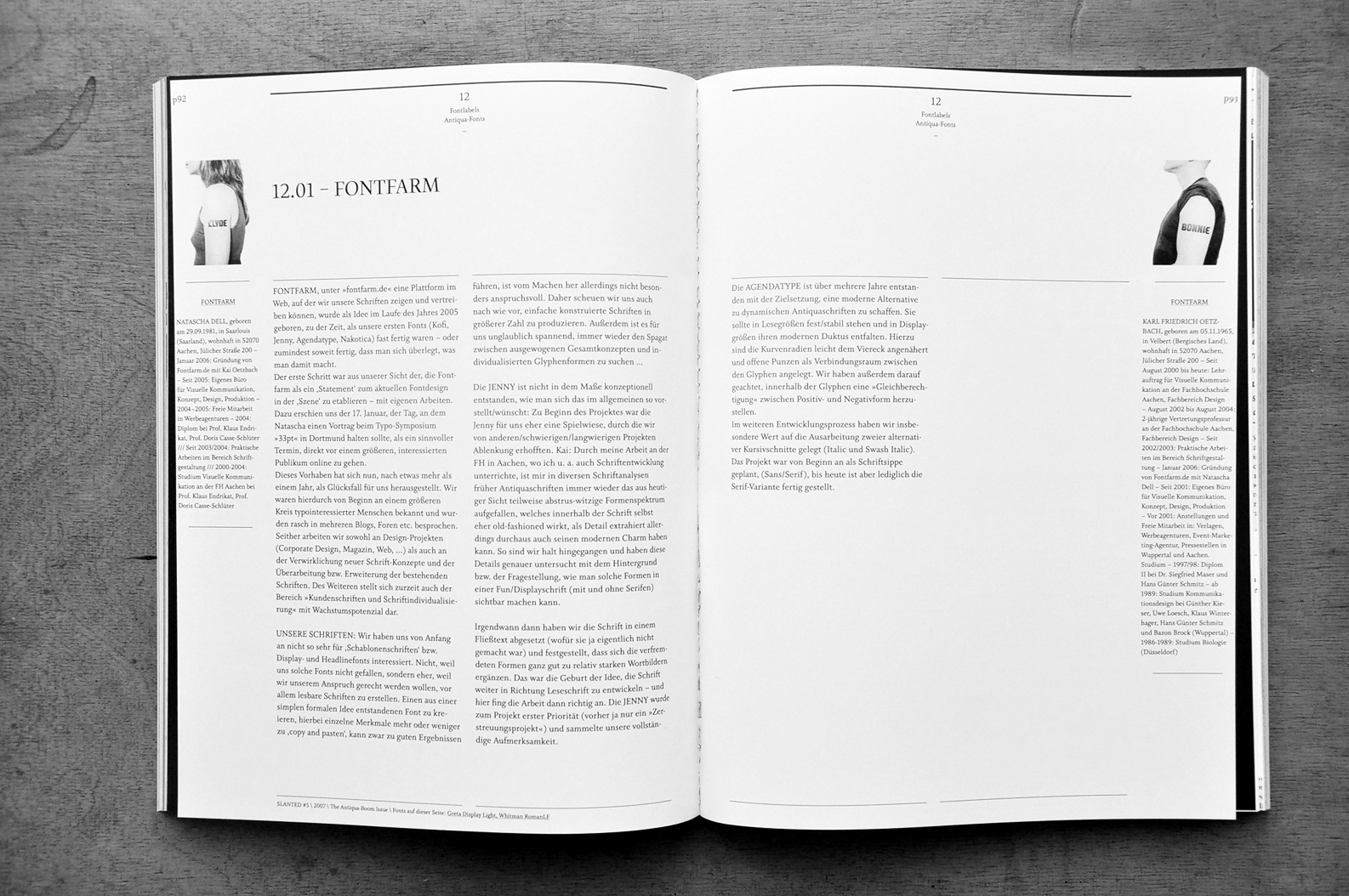
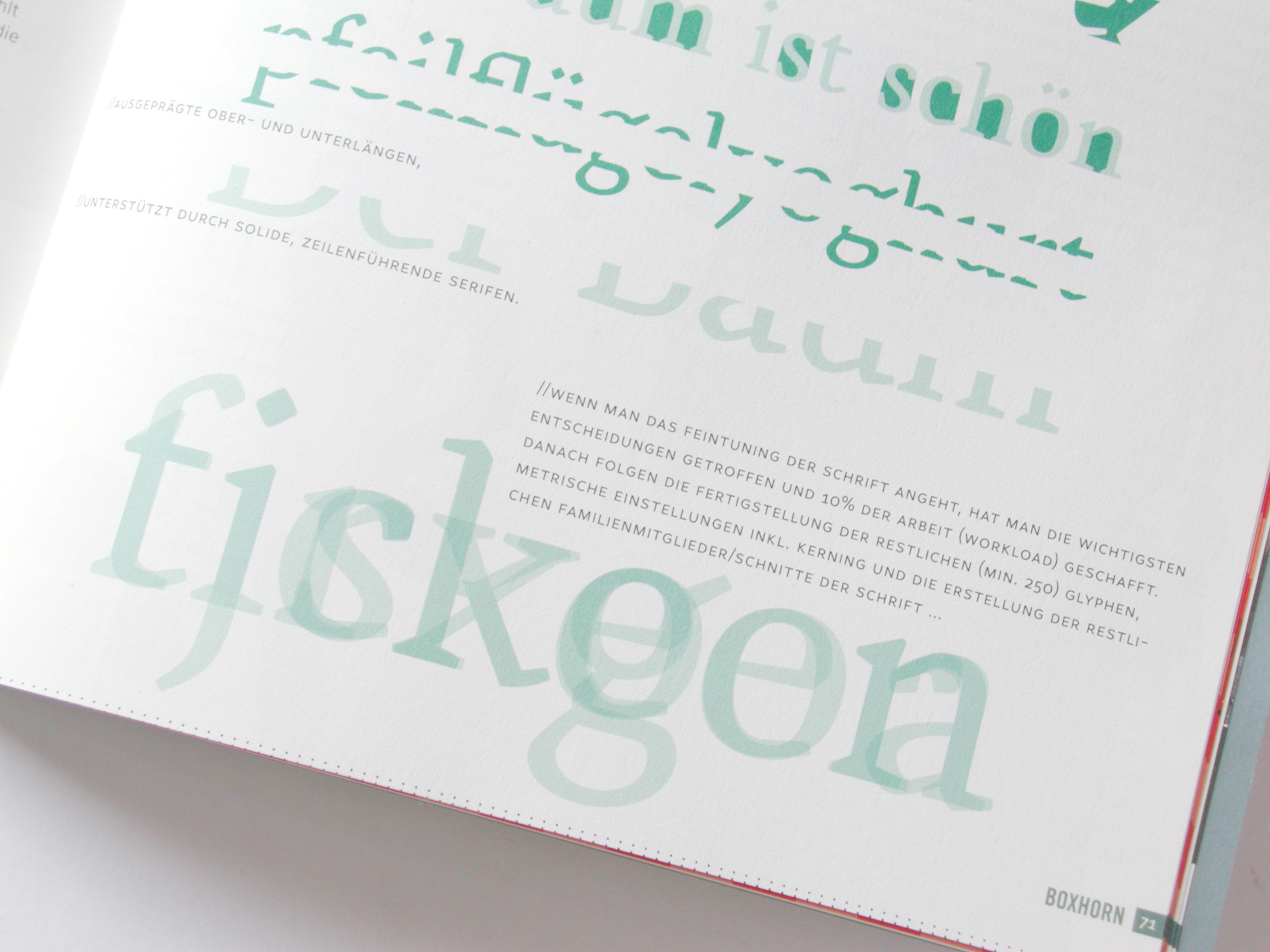
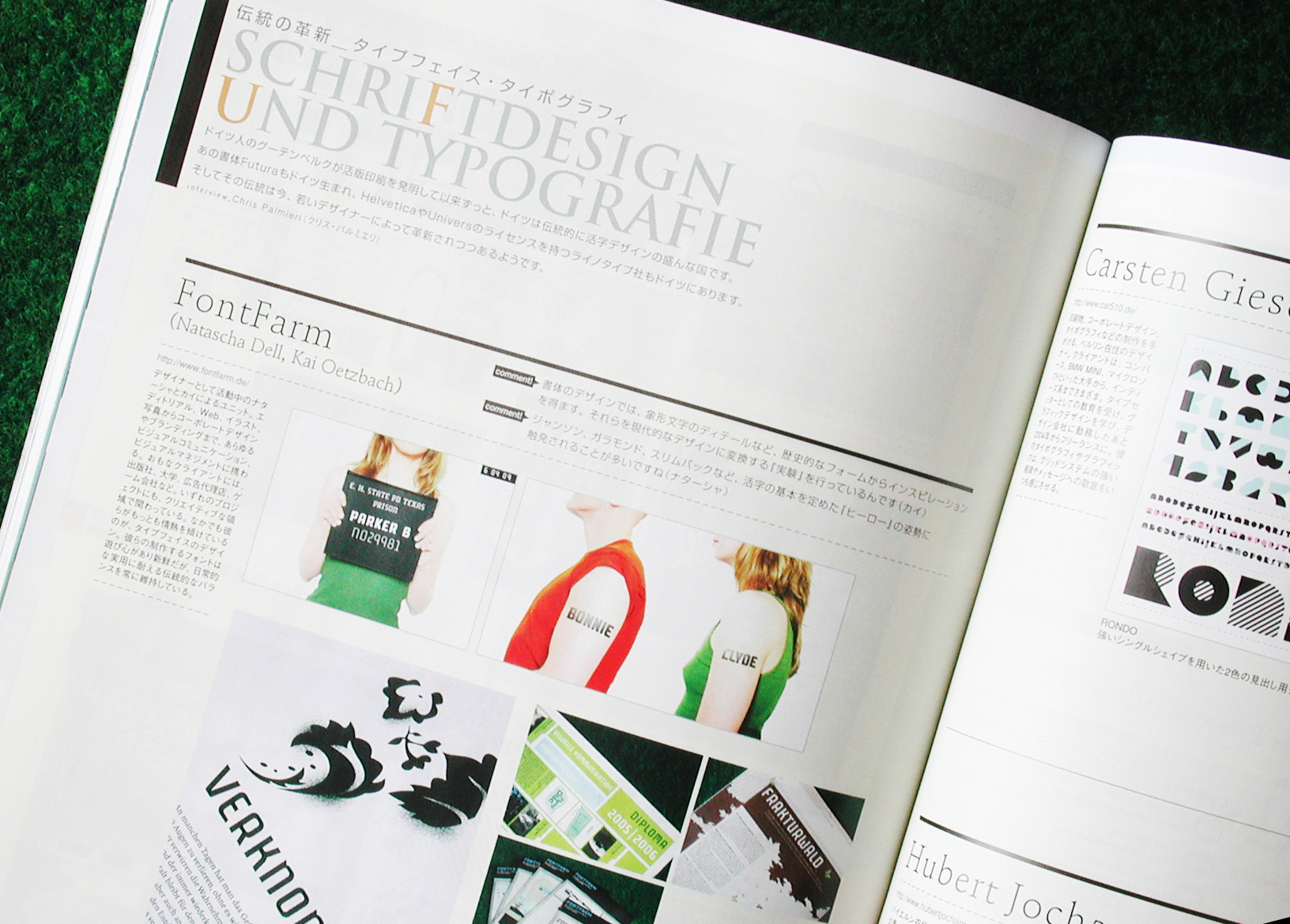
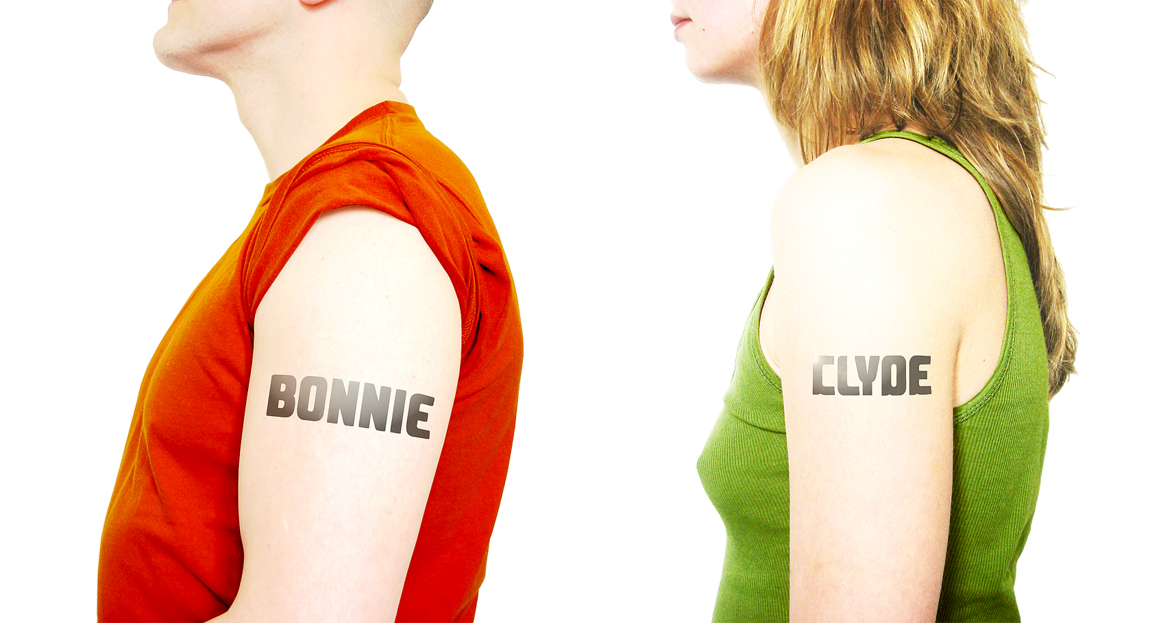
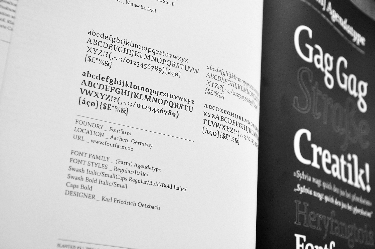
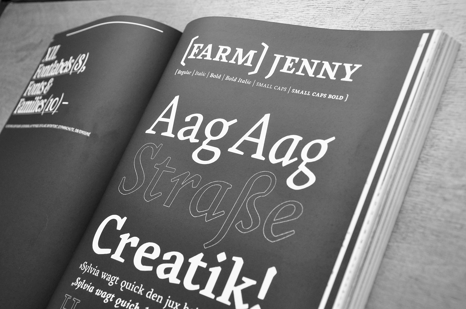
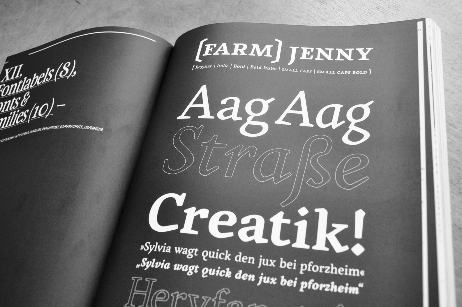
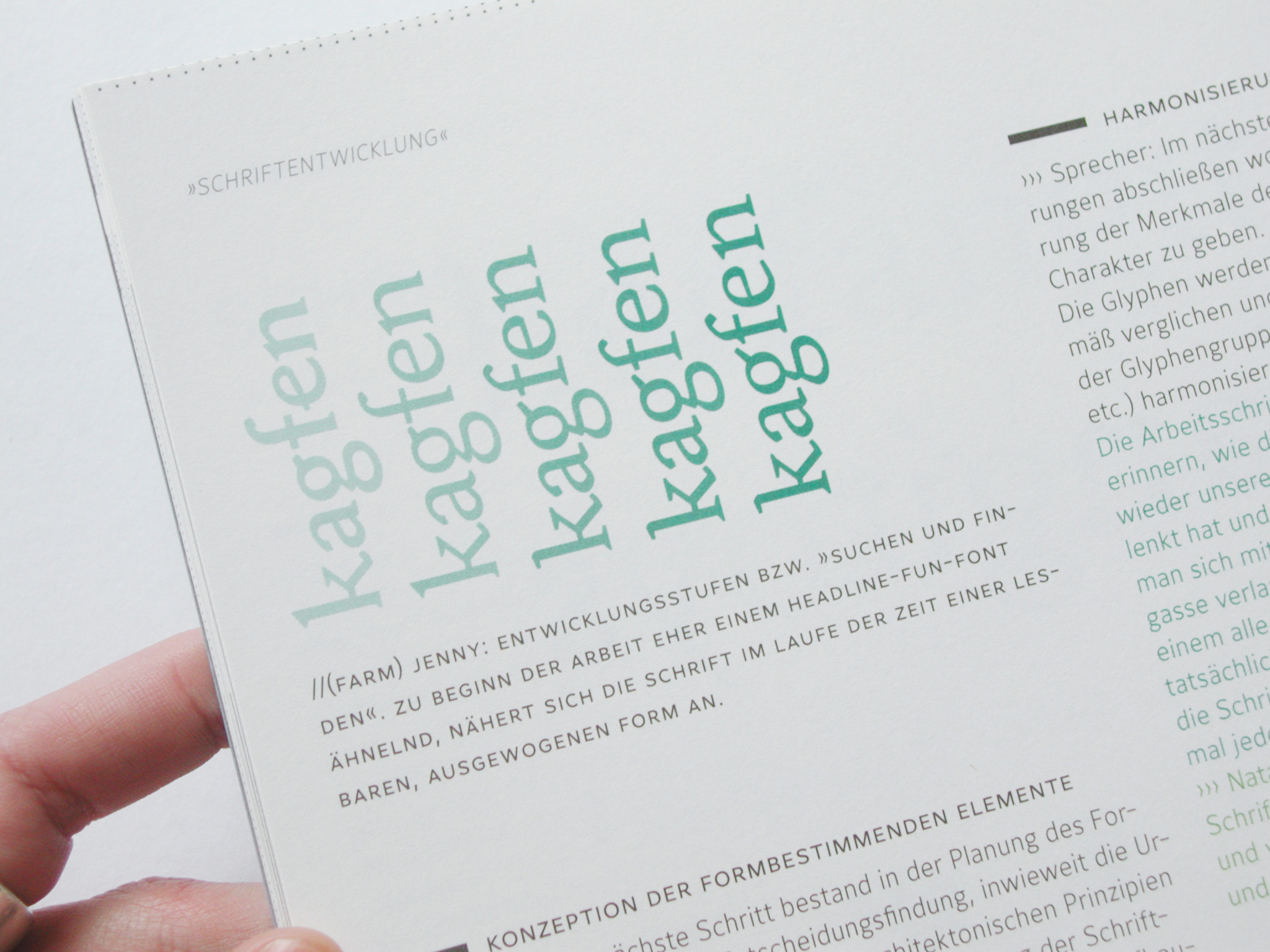
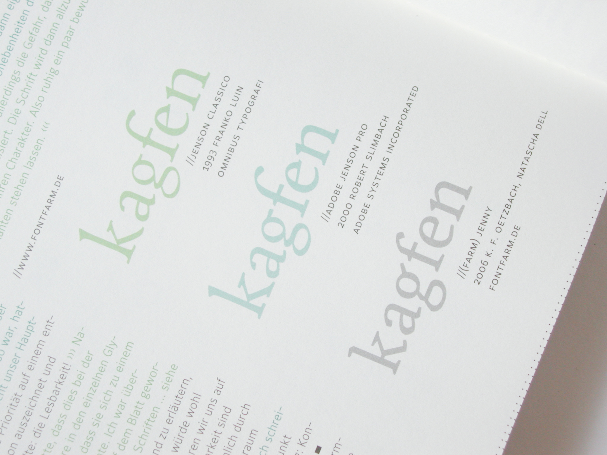
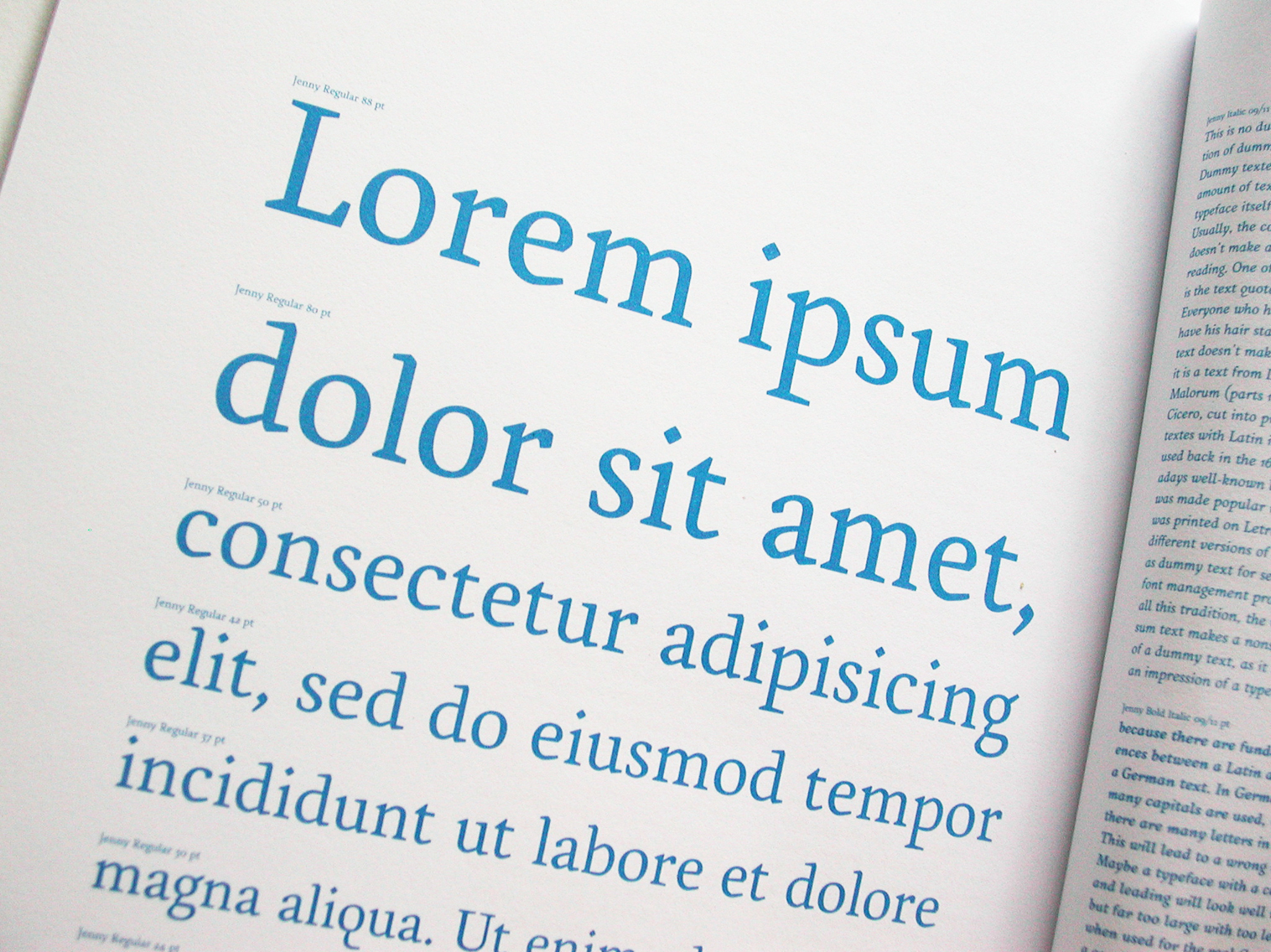
They all come up with a proportional enlarged x-height, slightly narrow appearance, an antiqua-stylish-open letter »a« and a two-story »g«. It is obvious, that the formal architecture of all these fonts is the result of combining a reasonable legibility with an economic, space-saving setting.
In the design-process ofThe naming of
Heusenstamm, Germany
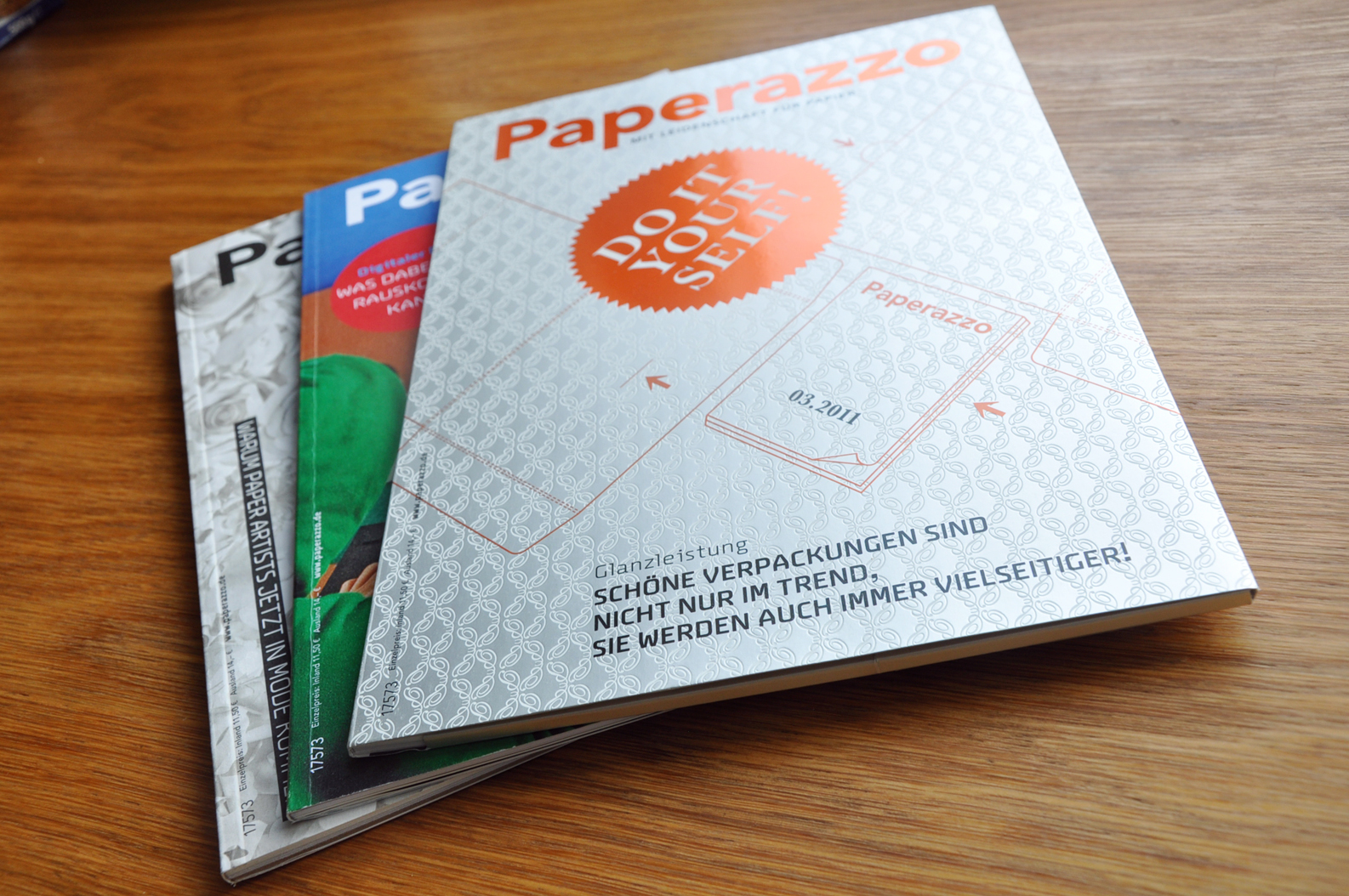
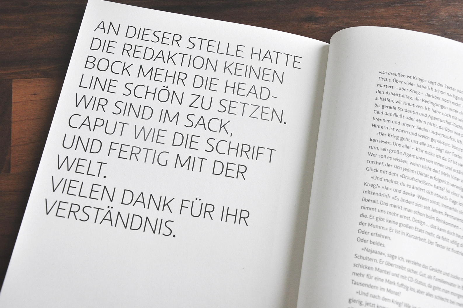
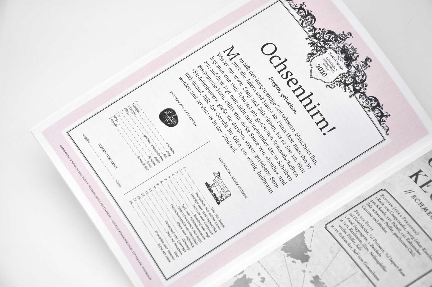
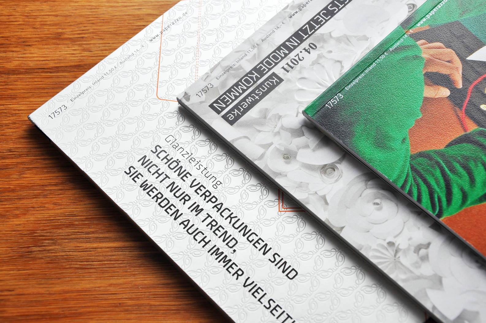
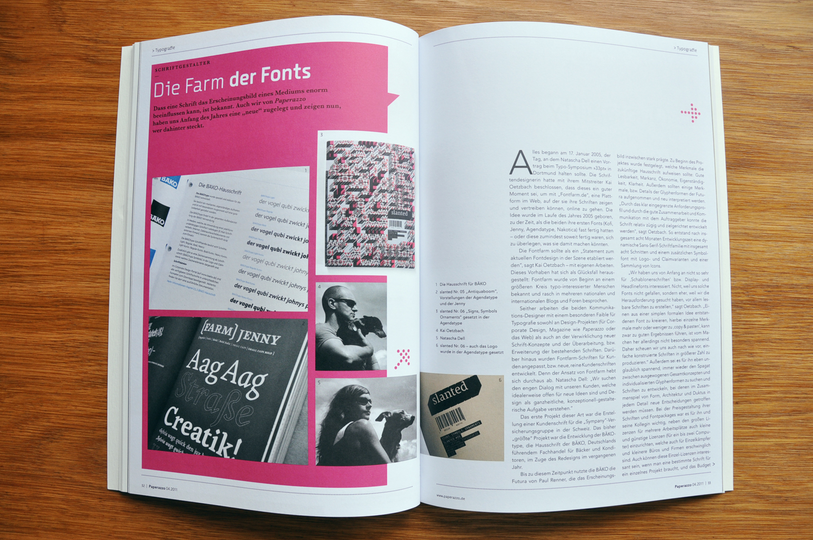
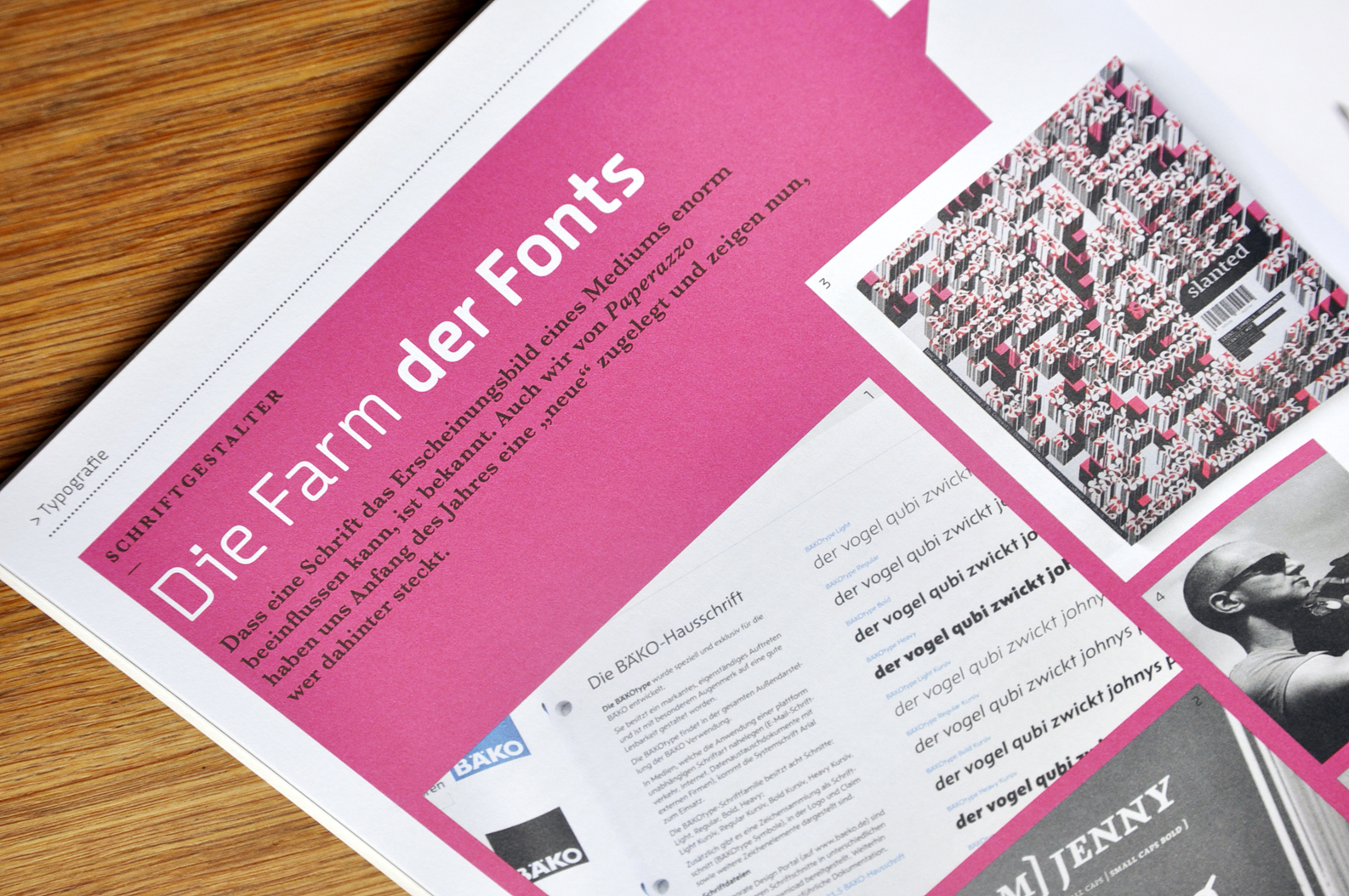
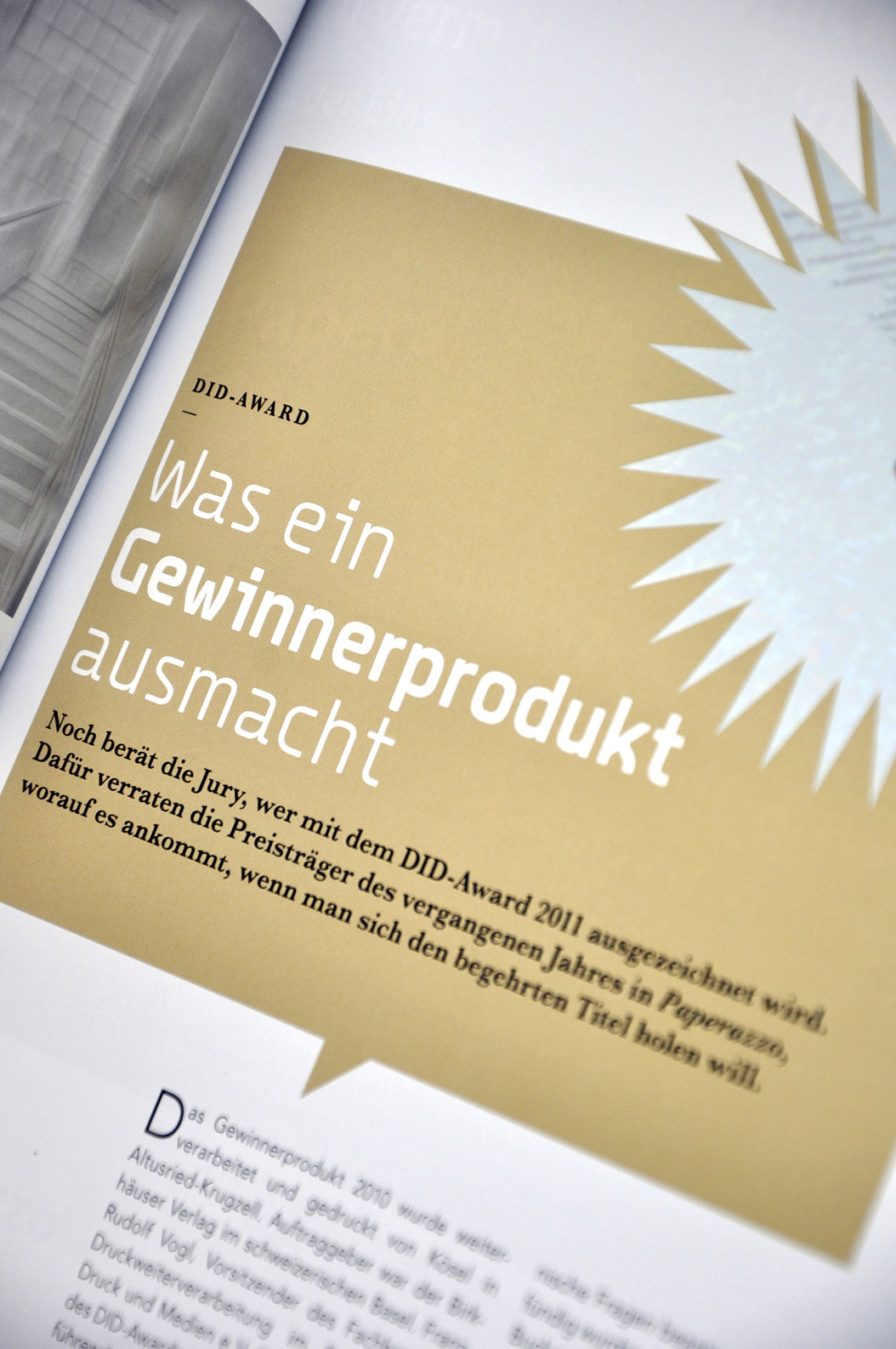
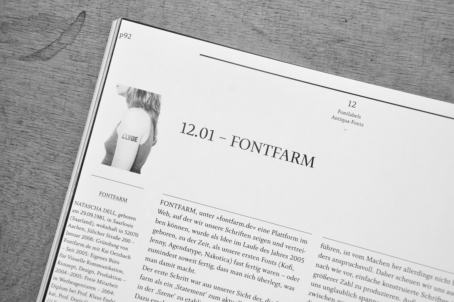
In Issue 04/2011 Paperazzo published a three paged report on the life on the Farm. Many thanks to Susanne Haase (Editor-in-chief) and to Maik Brummundt (Artdirectior); www.maikbrummundt.de
Fonts in UsePaperazzo Homepage
Maik Brummundts Homepage
Karlsruhe and Mainz, Germany
Quotation (Typodarium.com): »A tear-off calendar, just like the one our grandma used to hang in the kitchen. But this calendar unveils a new font everyday. We can therefore have, a whole year long, the chance to broaden our knowledge, to discover the font's history and developement, to possess a piece of jewellery that is new everyday. On the front, the font will be prominently displayed, and on the back it will be described in details. How it originated, from what or who came the inspiration and where we can obtain the font.«
Fonts in UseTypodarium-Project
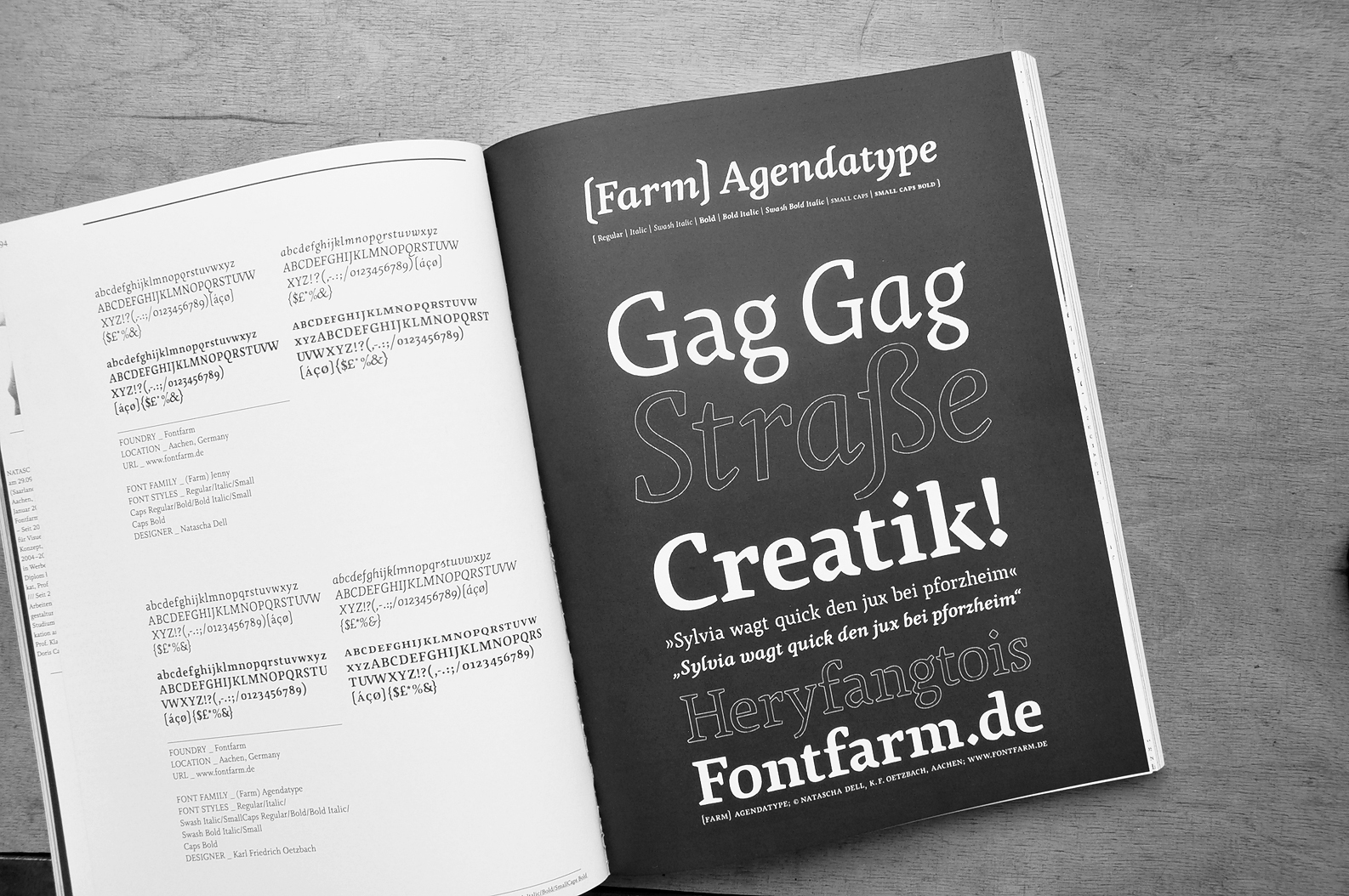
Aachen, Germany
Info on BOXHORN
Stolberg (Aachen, Rhld.), Germany
wählt die
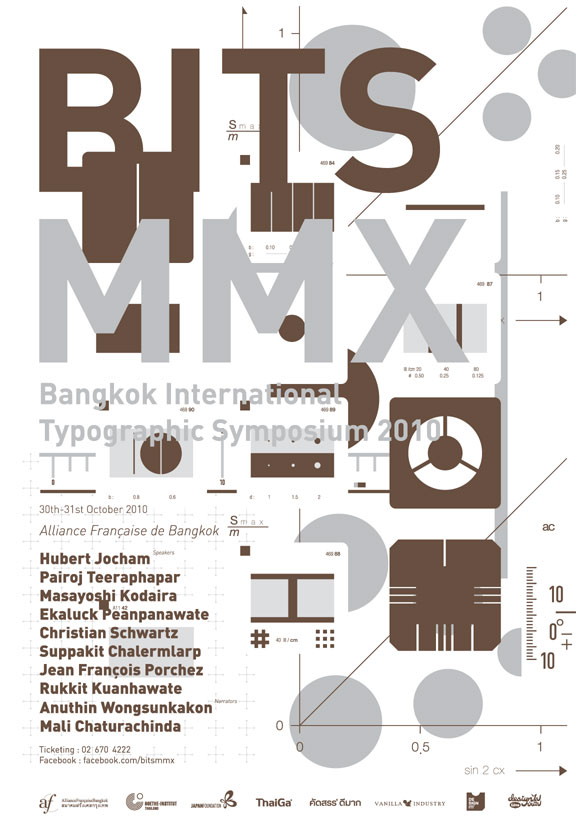
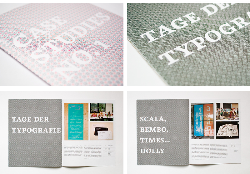
Typographic Symposium
»Bangkok International Typographic Symposium« — mit Plakaten der Schrift
Stolberg (Aachen, Rhld.), Germany
Please note that if you upgrade

Klingspor-Museum, Offenbach
»Schrift in Form II – Schriftgenuss«
Klingspor-Museum, Offenbach
Klingspor Museum
Stolberg (Aachen, Rhld.), Germany
The


This »new order« is a homage to the visual and to design. Orientation, information and sections still have their own right and place within the magazine's structure, but the changing of perspectives, the relations and associations are definitely not an expression by the medium of information, rather of openness and examination.
It's a concept that doesn’t come under the hegemony of function, a feast of the visual.« (Quotation Slanted Press Release)
Our Contribution:SLANTED #11
»TypoLyrics – the sound of Fonts« —
MAGMA Brand Design, Birkhäuser Verlag
Typeface:
TypoLyrics in the slanted shop

Stolberg (Aachen — Rheinland), Germany
Font Collections
Font Overview


Stolberg — Bonn — Duisburg, Germany
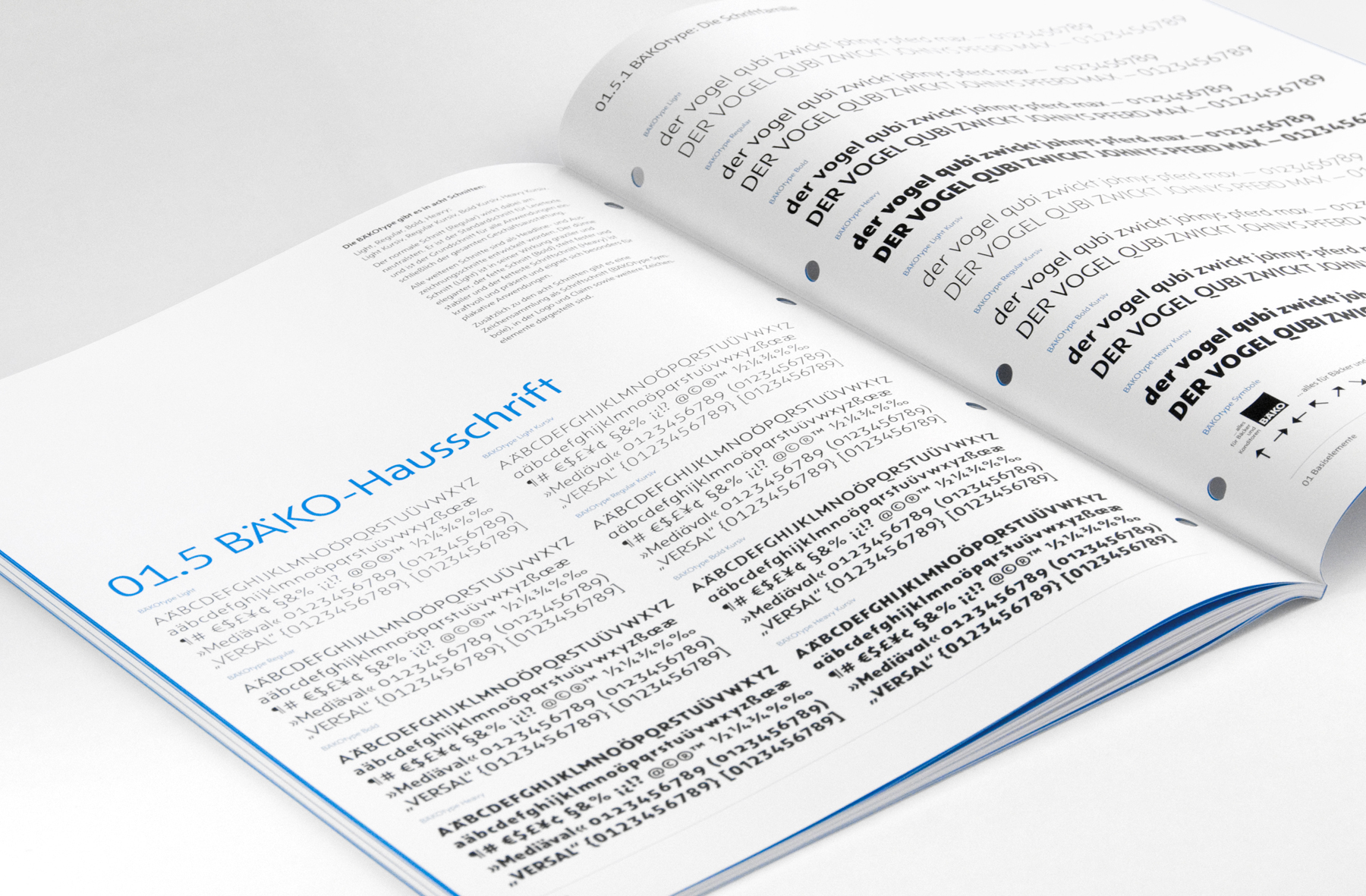
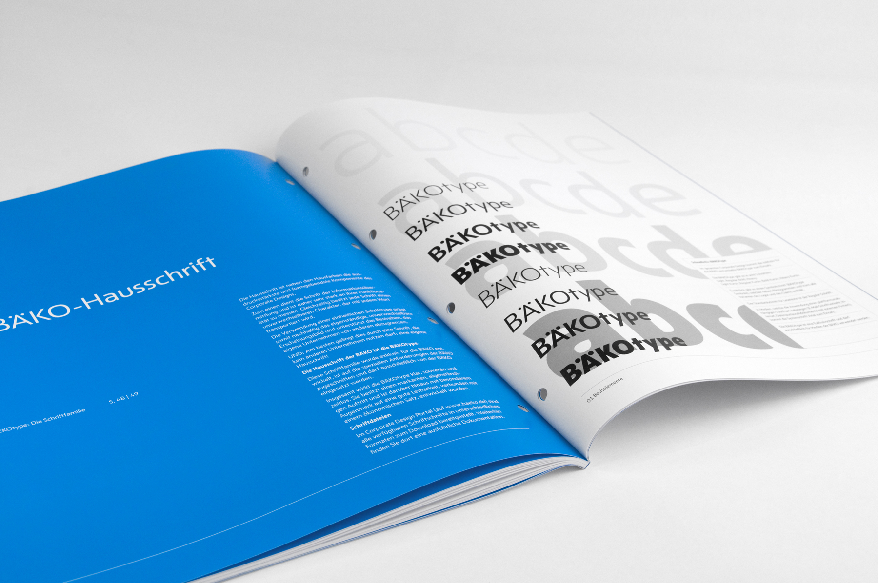
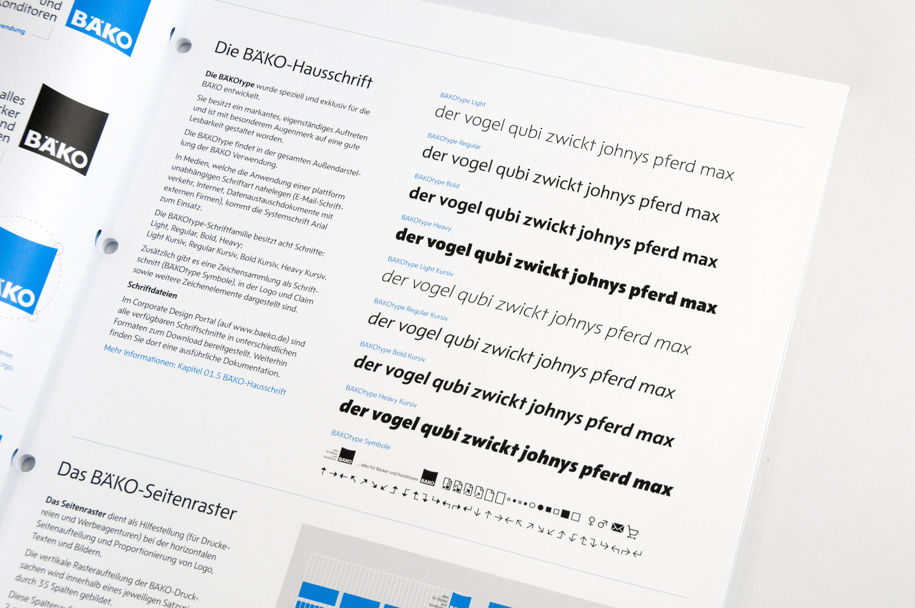
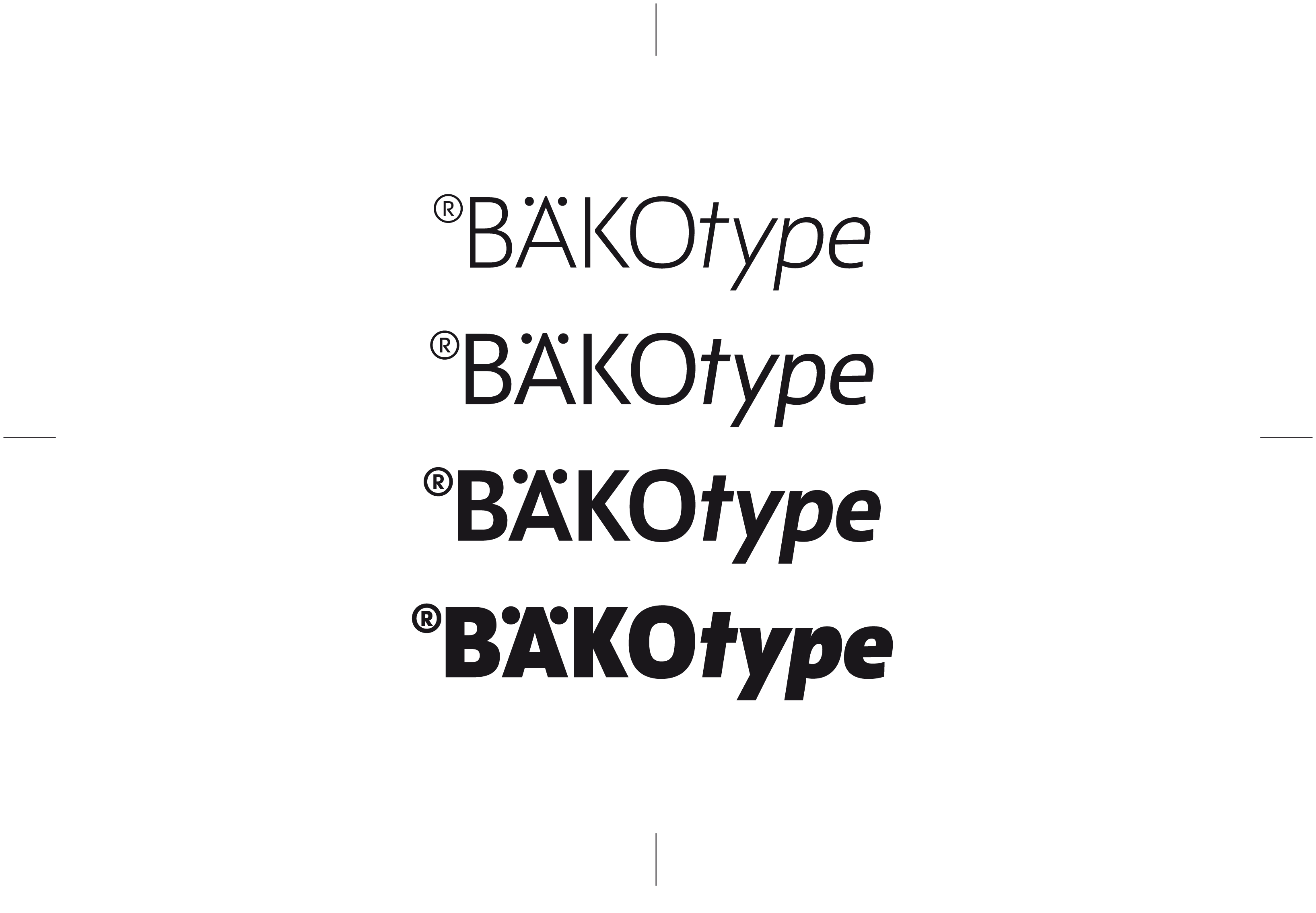
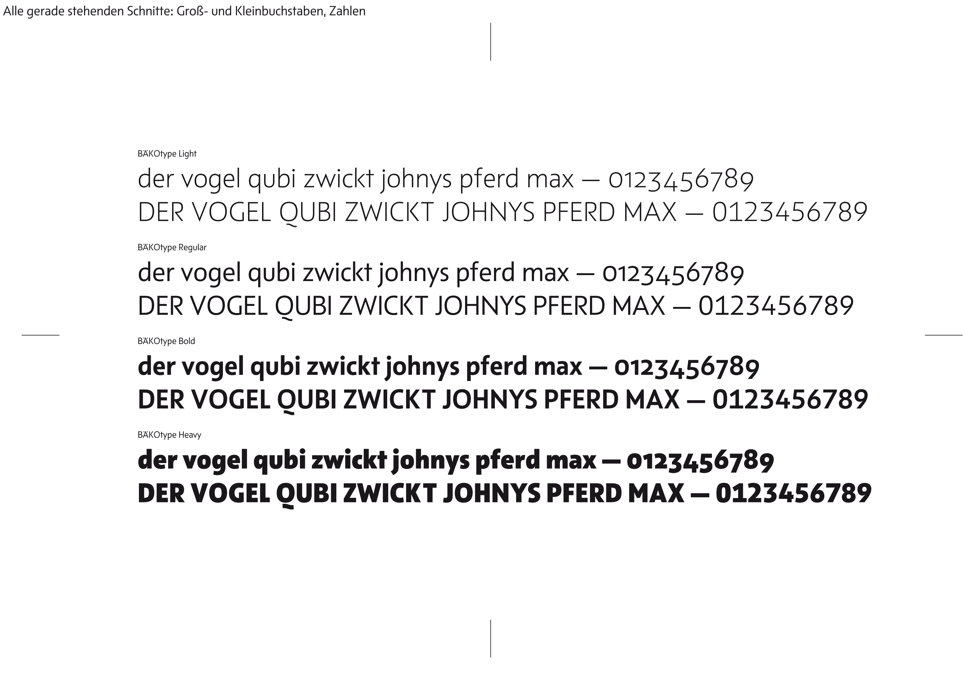
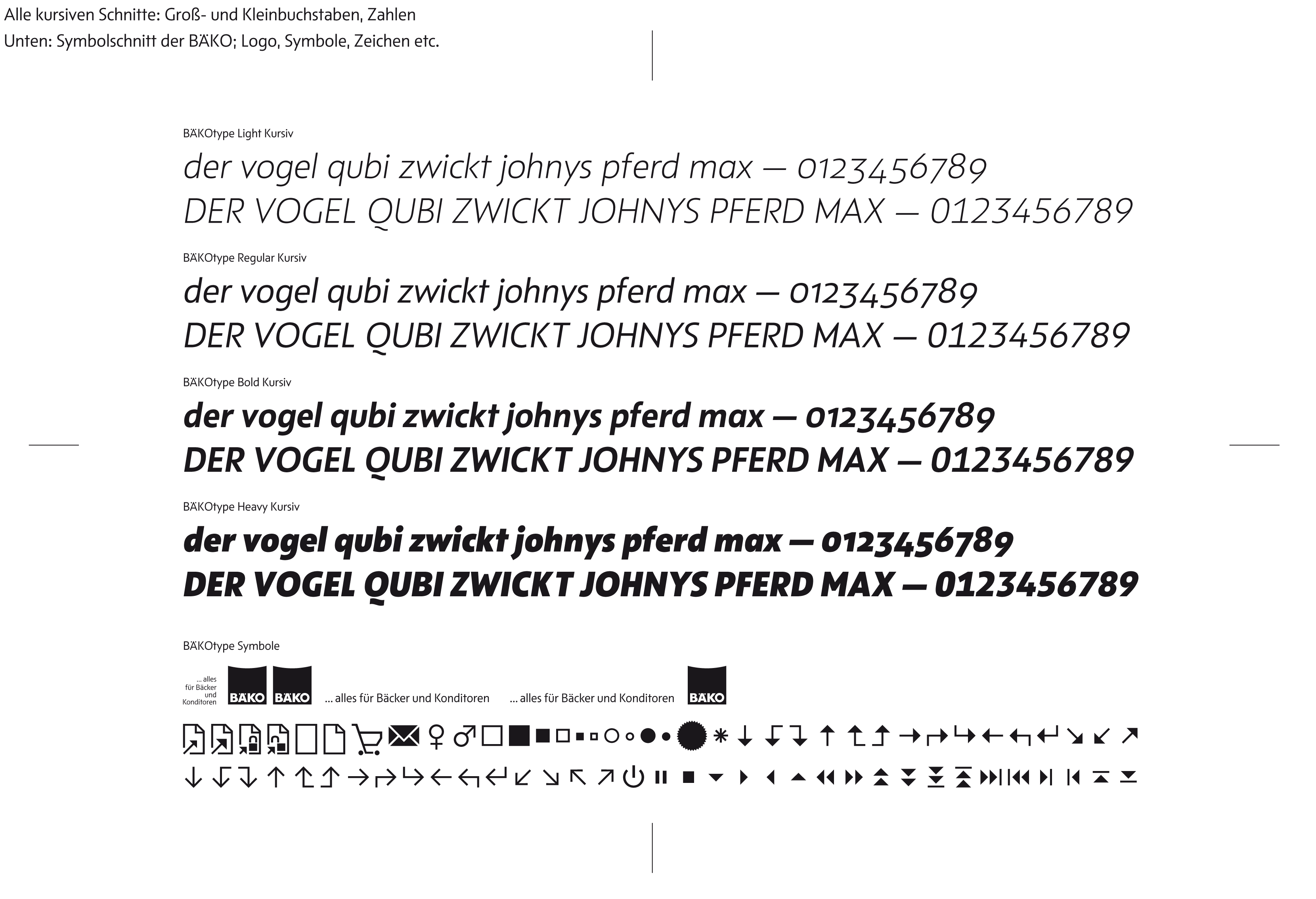
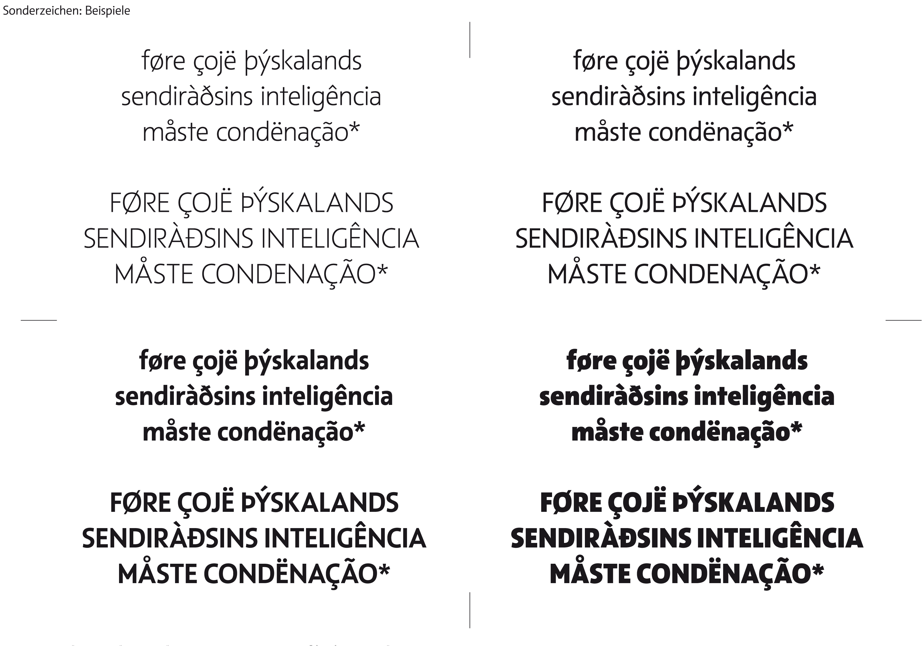
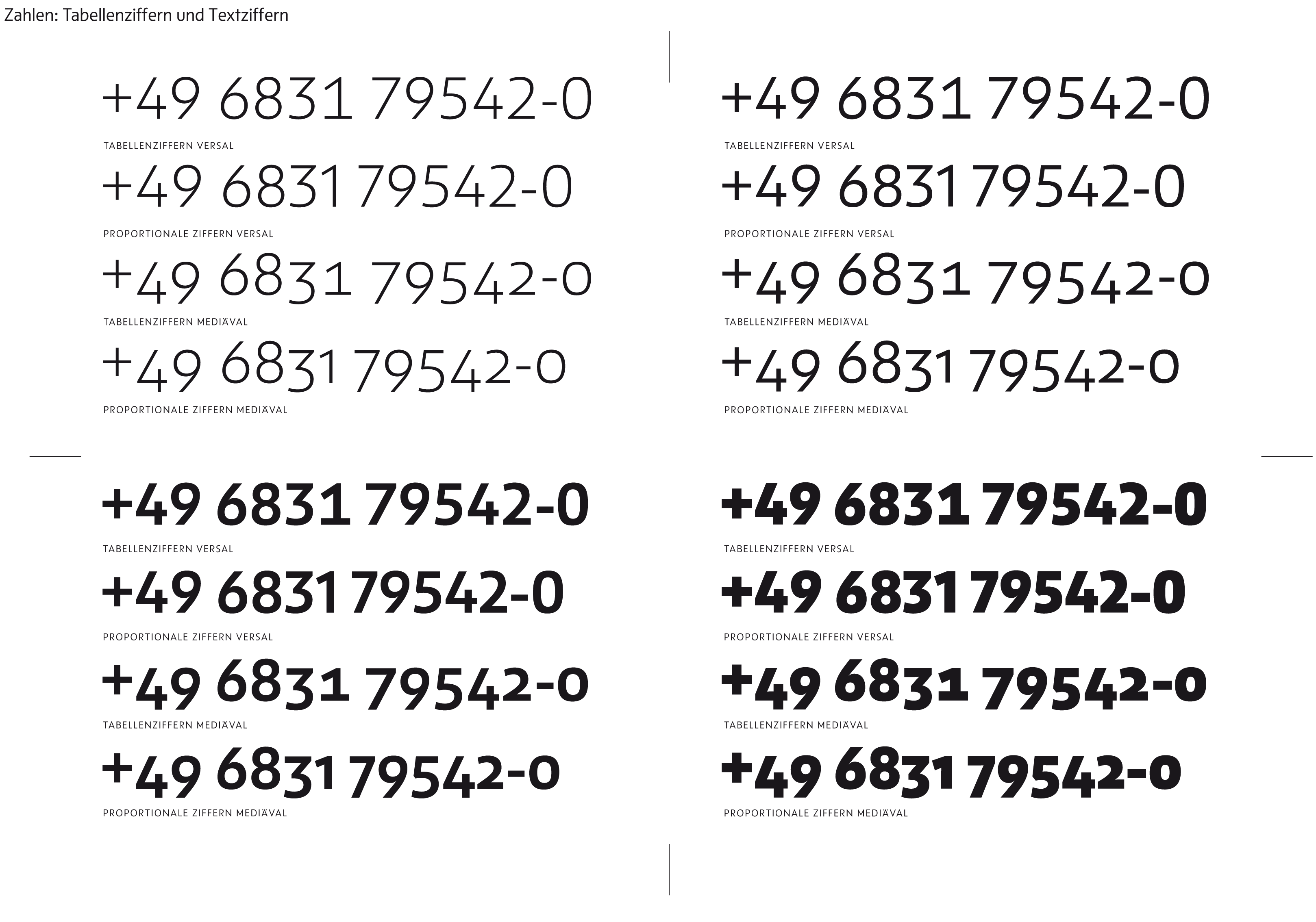
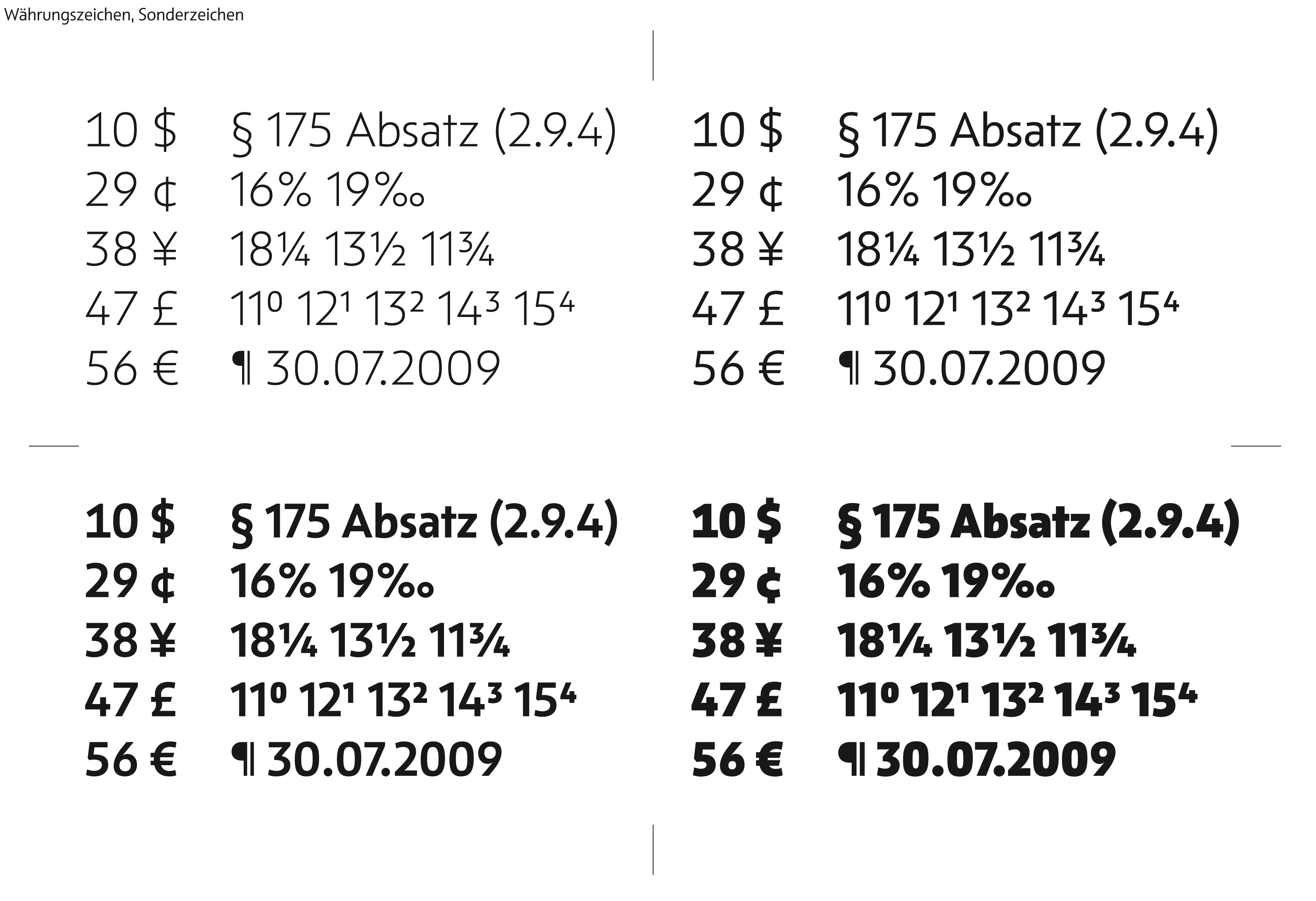
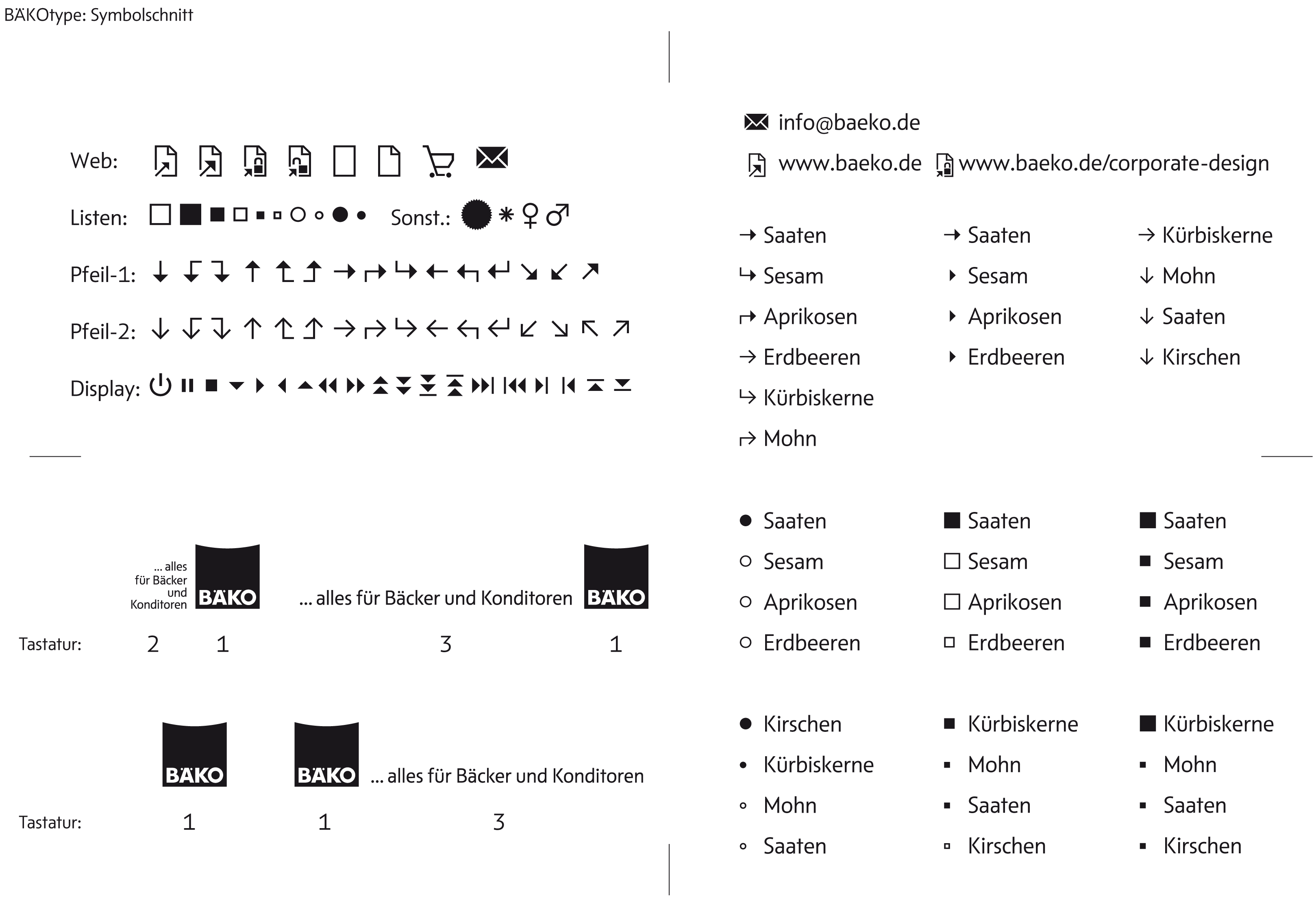
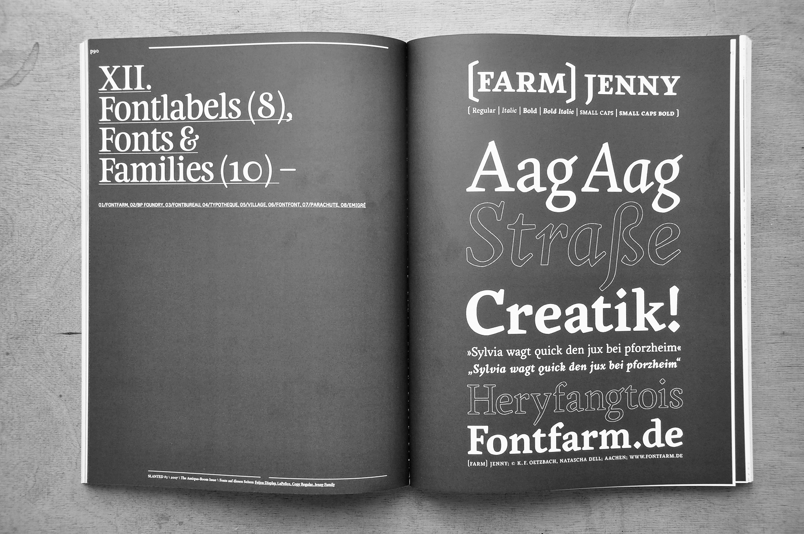
We established the typefamily with eight styles: Light, Regular, Bold, Heavy and the corresponding italic styles. A small addon is a symbolfont with the most used signs and icons and the BÄKO logo with its claim variants.
This font is just made for the usage in the BÄKO group and it's unfortunately not for sale … Customfonts: Examples

Hochschule Mannheim,
Fakultät für Gestaltung
Homepage Anna Schlecker
Hochschule Mannheim,
Fakultät für Gestaltung
komma on »behance«
Stolberg (Rhld.) / Amsterdam
We decided to take the chance and to make a complete review of the font. So now
Niels Schrader @ home
France
Quotation: »Fontcase is a font management application that provides an elegant and powerful workflow to help you organise the fonts you have installed on your system. Designed to be an iTunes for your fonts, Fontcase has a powerful tagging system, which is designed to let you control your fonts like you control your music.«
Laurent Baumann’s Website

Karlsruhe, Germany
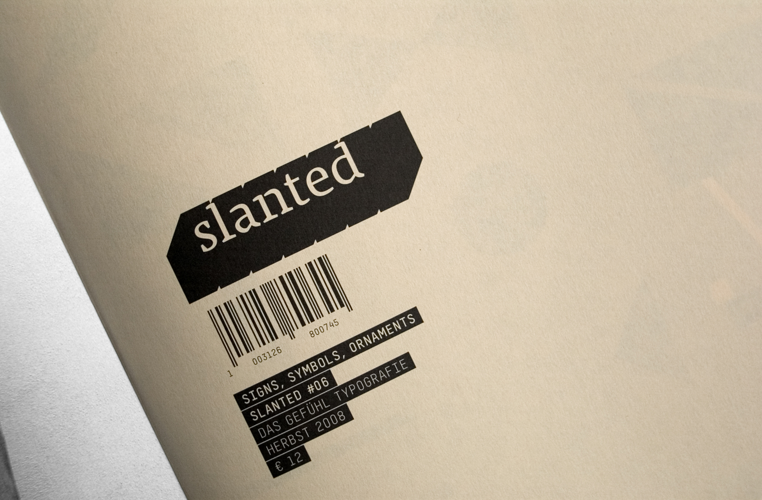
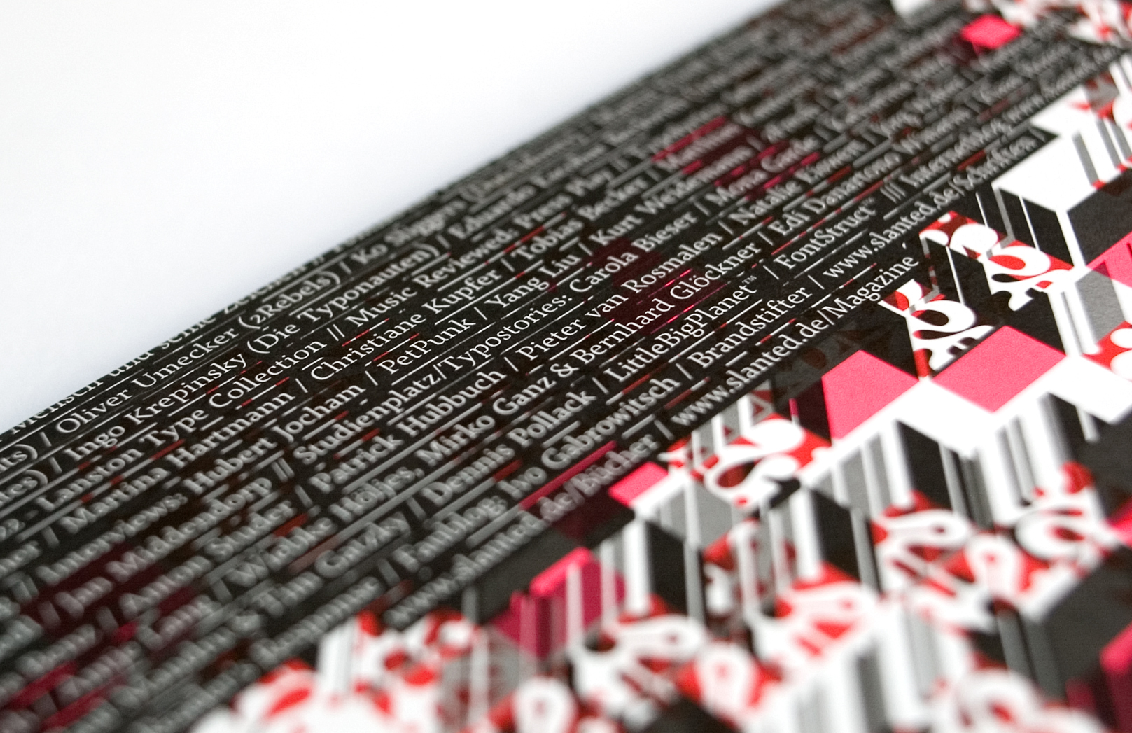
Der Fokus des aktuellen Magazins liegt auf Zeichen, Symbolen und Ornamentschriften. Diese Thematiken werden in einer ersten Sektion in Artikeln, visuellen Essays, in Font- bzw. Fontlabelportraits sowie den Rubriken Fontnames Illustrated, Typolyrics oder Fotostrecken beleuchtet. Mit Beiträgen von Marian Bantjes (die auch das diesmalige Cover gestaltet hat), Prof. Johannes Bergerhausen, Typosition, Romibello und vielen anderen. Die zweite Sektion bietet Interviews (unter anderem mit Hubert Jocham, PetPunk, Kurt Weidemann, Raban Ruddigkeit und Jan Middendorp), ein Portrait des Museums für Druckkunst Leipzig sowie (Abschluss-)Arbeiten von Studierenden und andere Typostories. Der dritte Teil des Magazins stellt eine Verbindung zum Internetblog www.slanted.de her. Hier finden sich vieldiskutierte Einträge, The Reader's Response oder die Vorstellungen von Schriften, Büchern und Magazinen.«
Slanted: Signs, Symbols, Ornaments
Klingspormuseum Offenbach
Klingspor Museum
Stolberg (Aachen — Rheinland), Germany
In the beginning
Karlsruhe, Germany
Slanted Antiquaboom
Offenbach, Germany
Peter Reichard
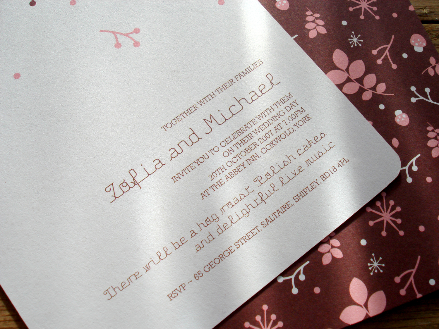
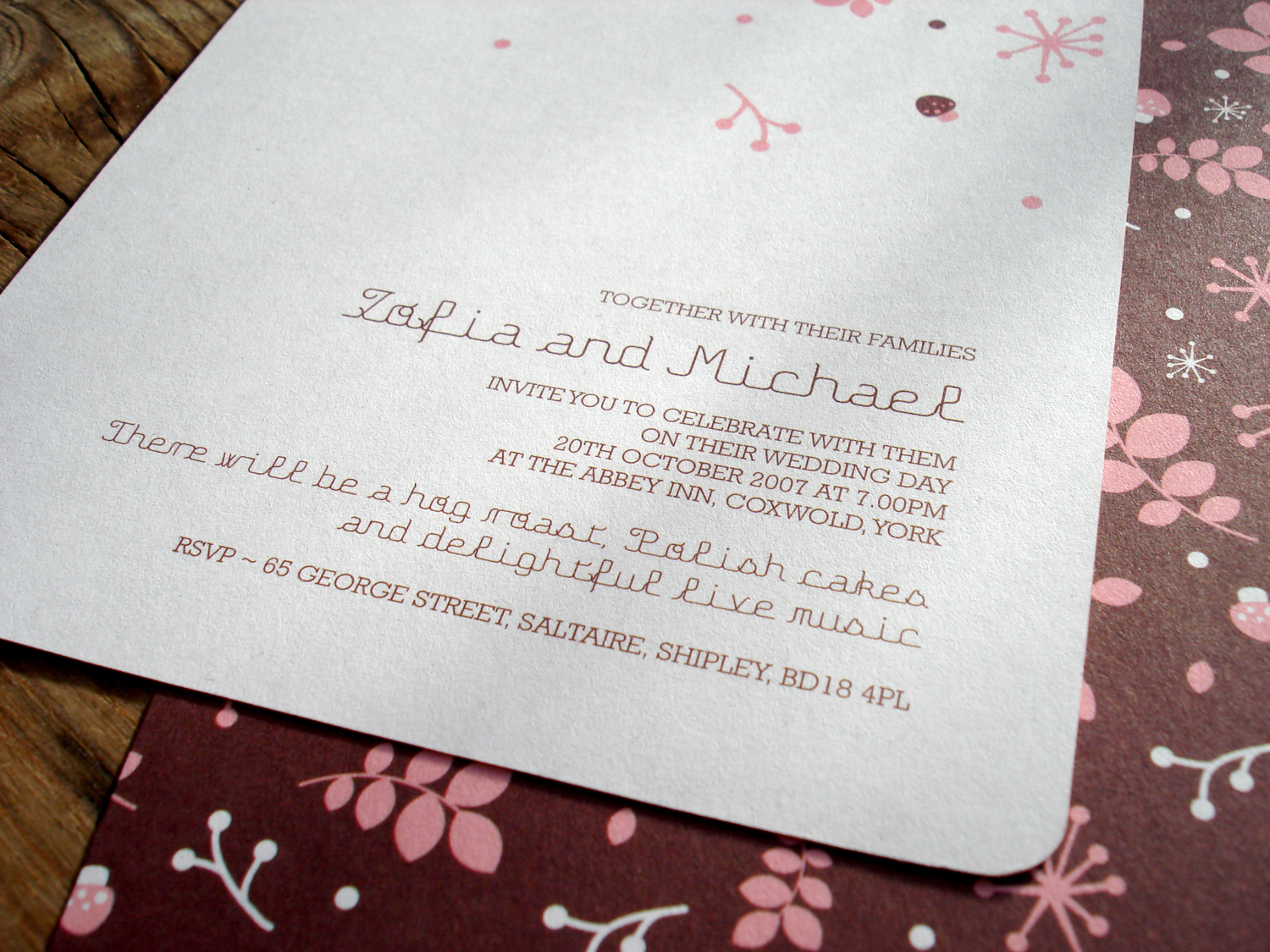
West Yorkshire, UK
»The wedding had a ›vintage autumn‹ theme and for the invitations a vintage inspired autumn pattern was created in browns, pinks and white which would carry over into other printed and decorative material for the wedding day itself.« (Quotation: mikmik)
Studio mikmik
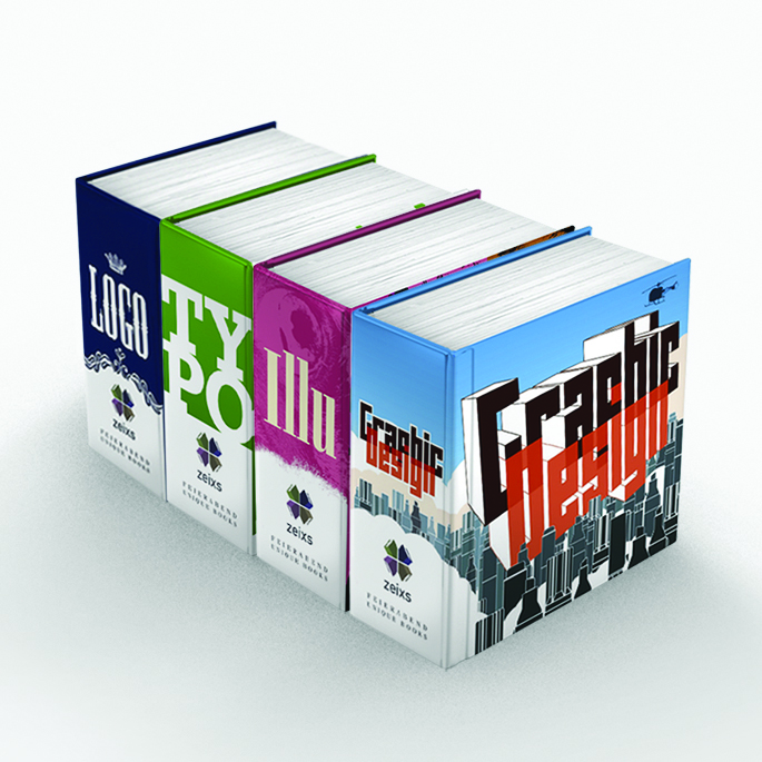
Cologne
The books look more than boxes than books, are somehow tiny but solid and are made for browsing and getting inspiration. Fontfarm backs the »zeixs« project with our fontface
ZEIXS
Tokyo, Japan
»For many Japanese designers, the cultural and historical nuances of Western typefaces can seem obscure, making choosing a typeface a daunting task. As a result, many Japanese designers stick with familiar favorites like Helvetica or Garamond, or grasp at decorative fonts that lose their flavor after a few bites. This series was originally conceived for Japanese designers, to introduce well-crafted Western fonts and the contemporary designers behind them. In the end though, we enjoyed these interviews so much ourselves, we decided to publish them in the English too.« (Quotation)
In this (Facetime-) series, some other interesting Type Designers like Eric Olson (Klavika), Jeremy Tankard (Bliss), Jarno Lukkarila (Xtra Sans), Chester Jenkins (Galaxie Polaris), Nikola Djurek (Amalia) are introduced. So perhaps you might have a look …Interview on the AQ-Website
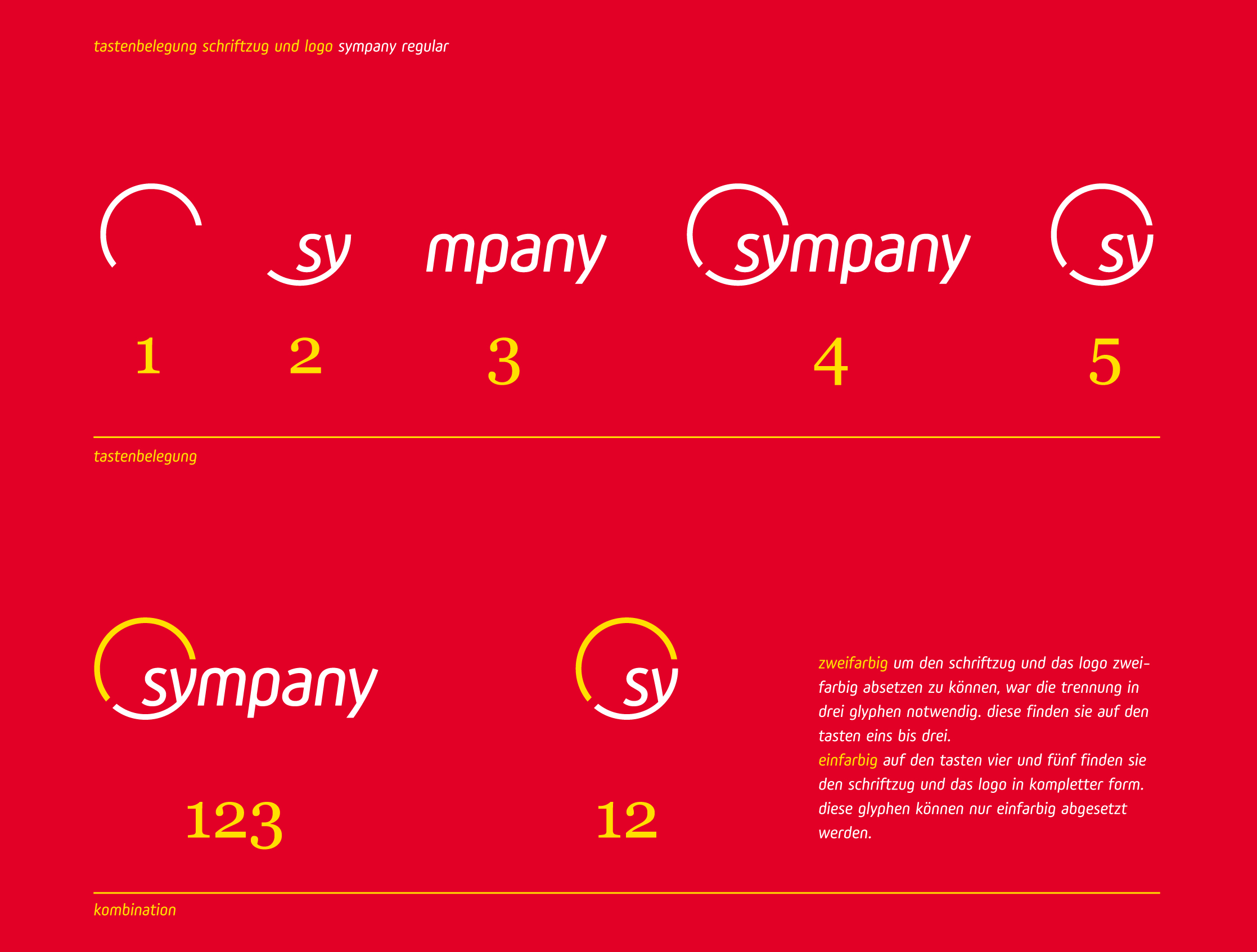
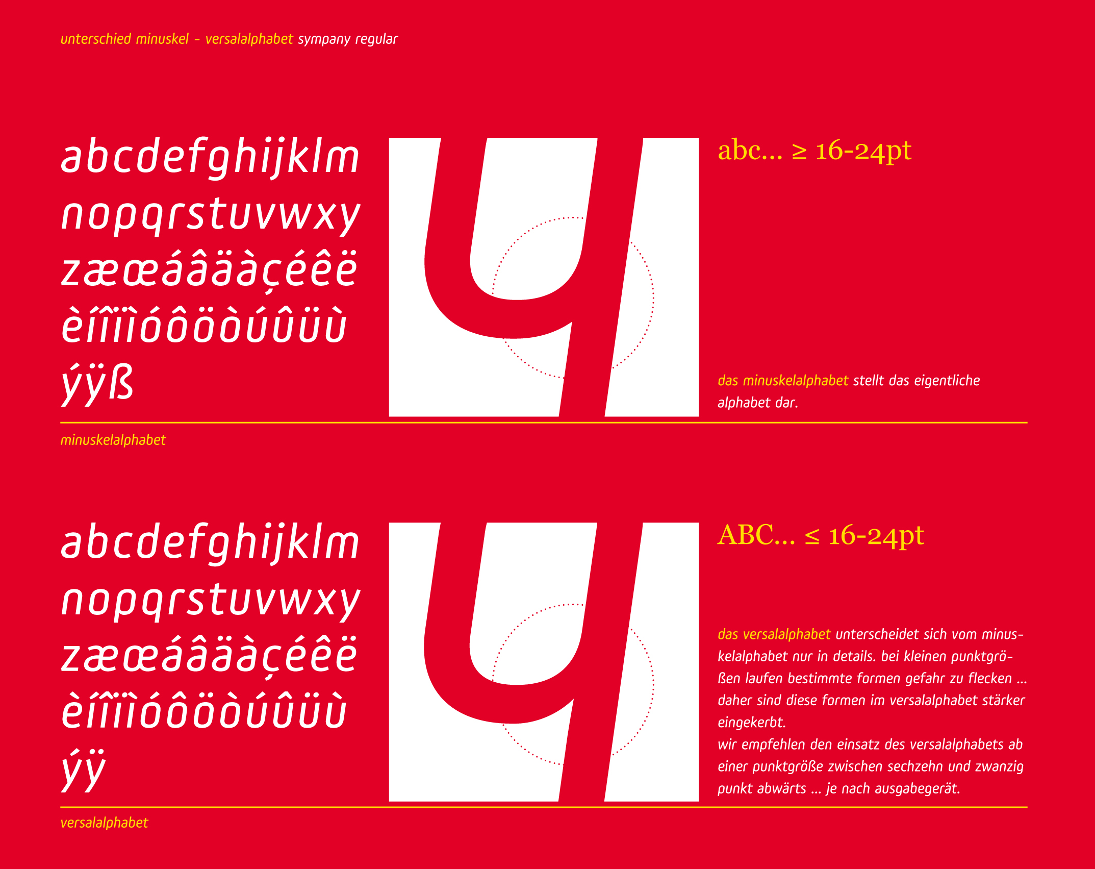
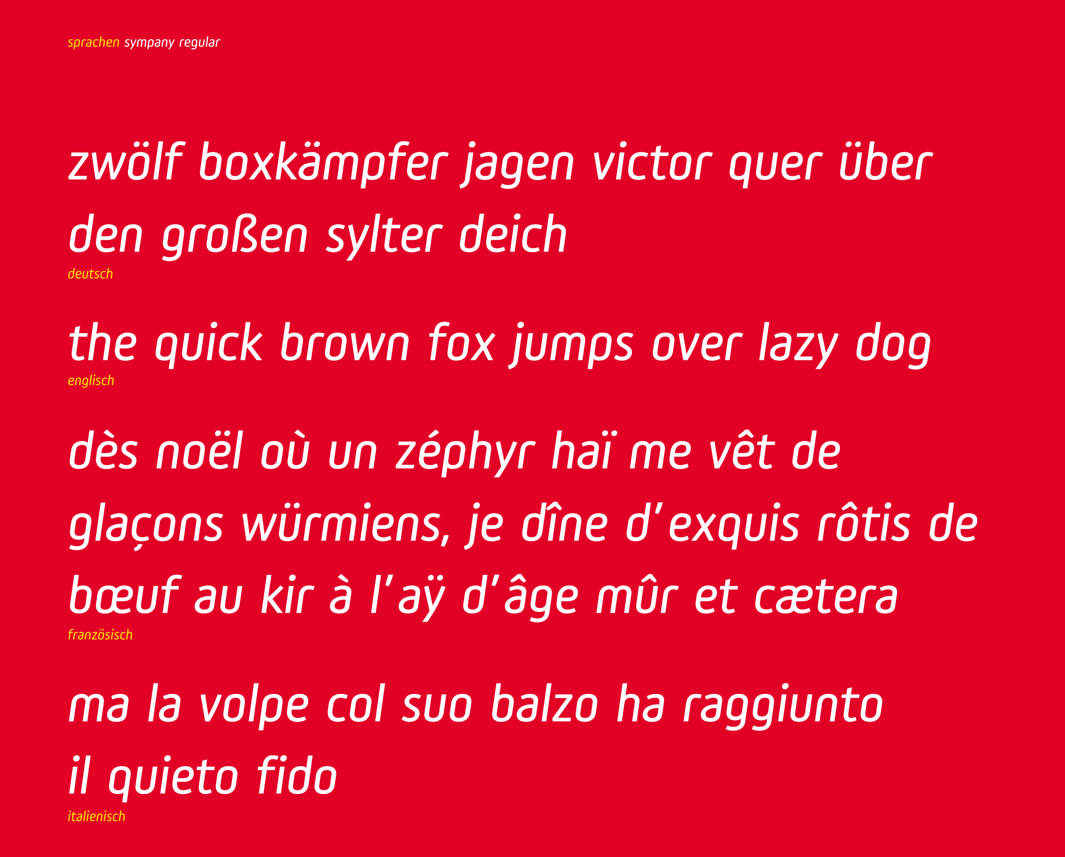
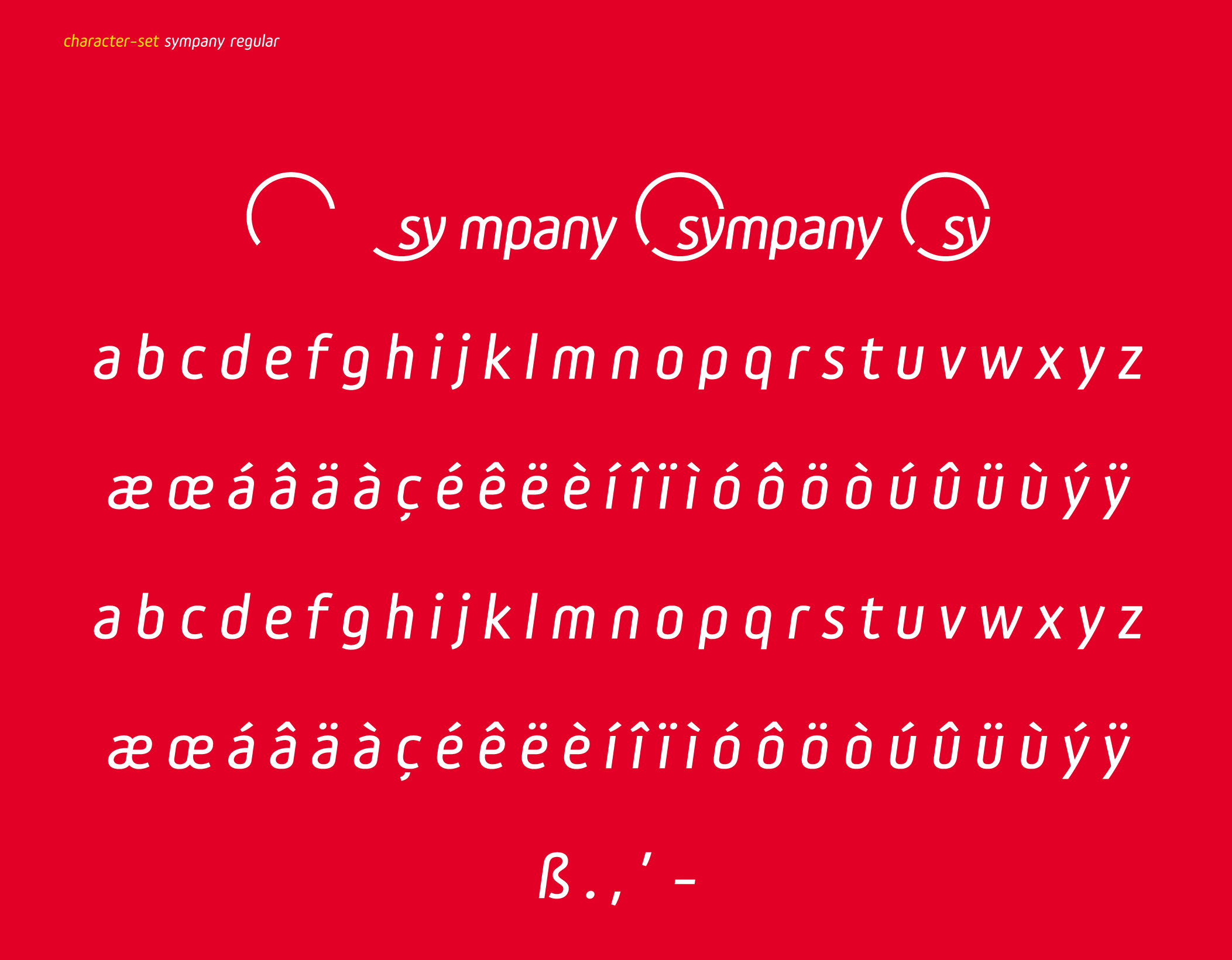
Basel, Switzerland
The font was created to work in harmony with the logotype (it´s only used close by the logo for sub-brands, additions and claims) and comes up with some goodies like two different alphabets for display- and text-sizes and the complete integration of various logo styles etc..
Customfonts ExamplesSympany Website
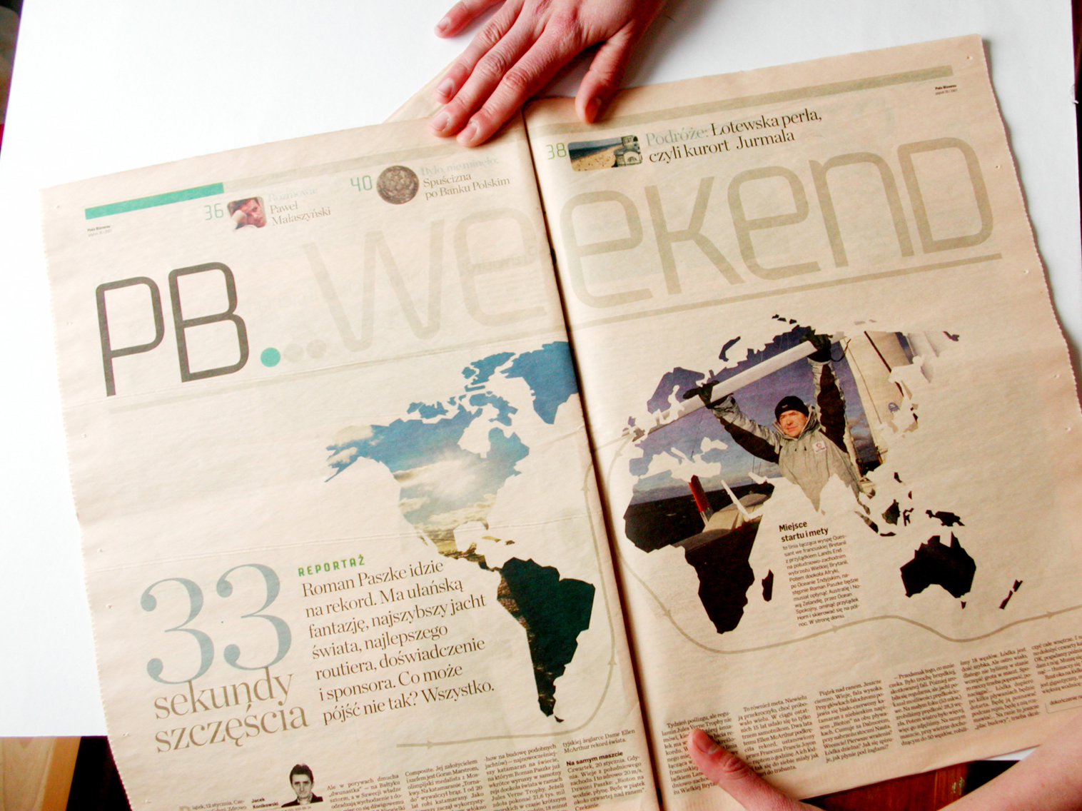
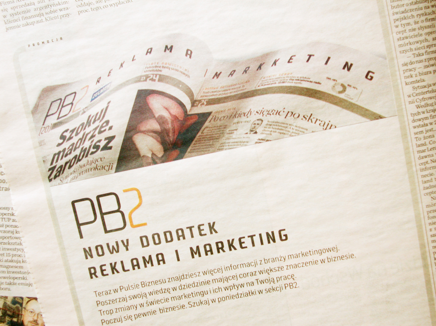
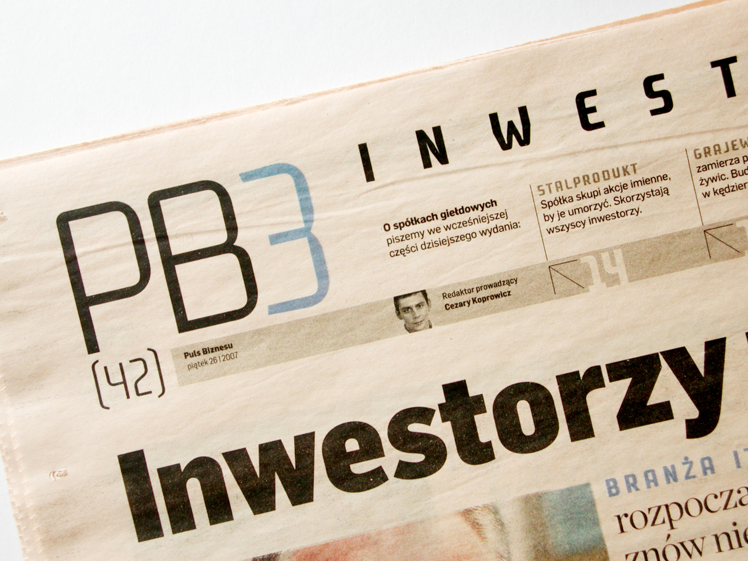
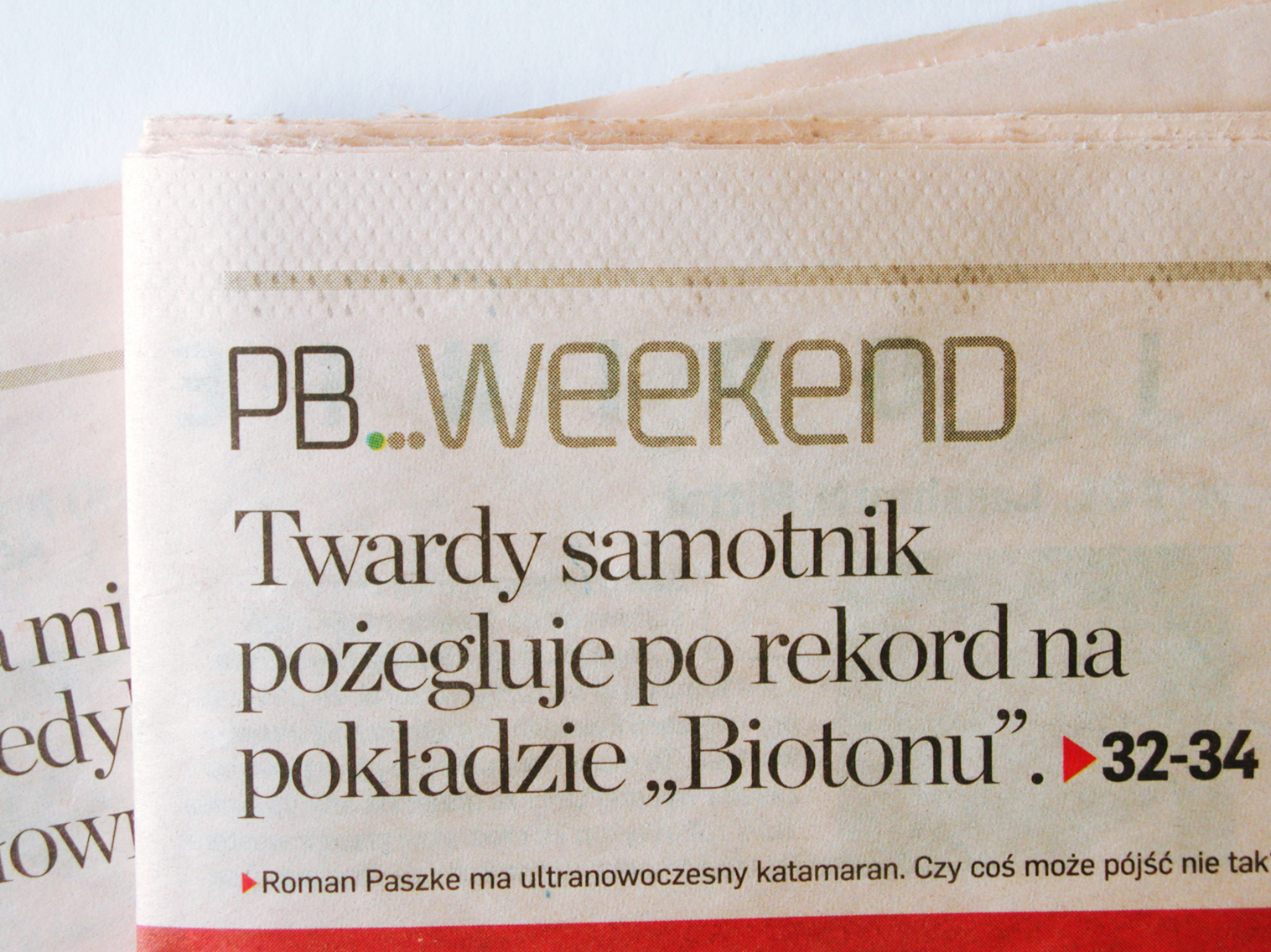
Warsaw, Poland
Beneath special glyphs you need in polish language we made smooth modifications on the diacritic marks.
Jacek Utko, a multiple decorated newspaper designer from Poland and design director of Bonnier Business Press – who made the newest re-design on PB (Puls Biznesu) – sent us some issues of the new styled paper.
Puls Biznesu Homepage
Aachen, Germany
All our (Kofi-) clients, who like to get an update of Kofi will recieve an actual Version of the Font for free. You yust have to write a mail to ko@fontfarm.de.

Aachen
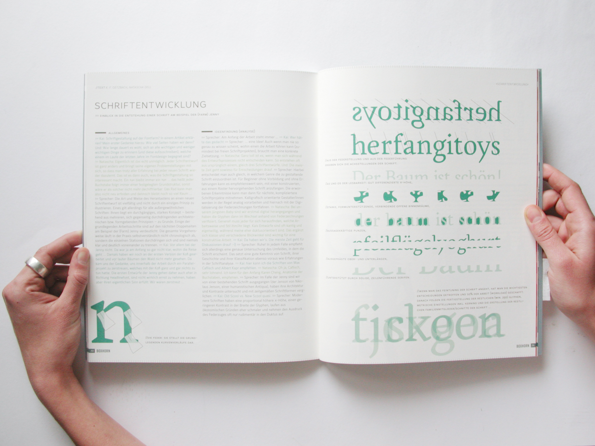
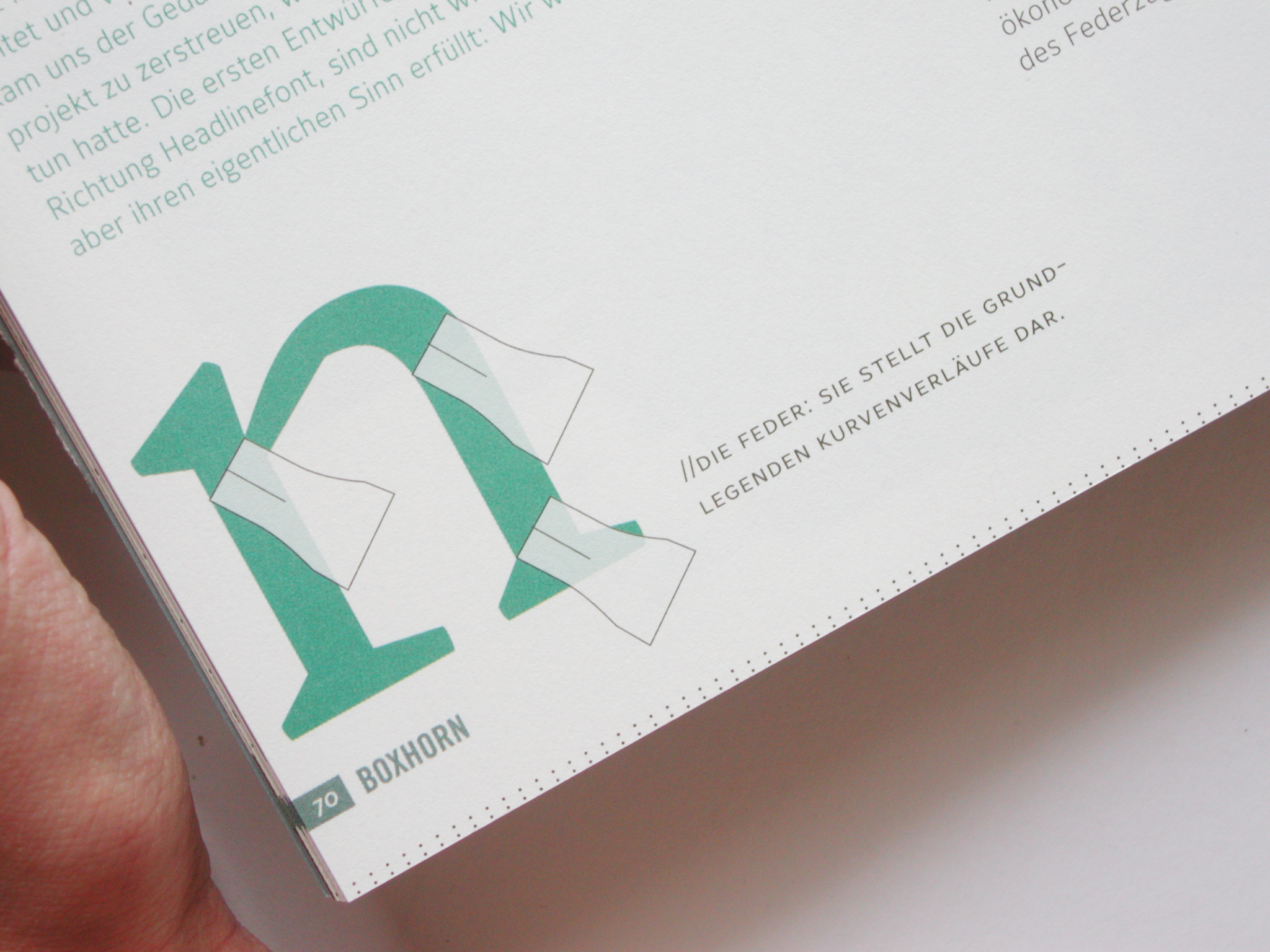
Although it seems to be impossible to describe the type design process in a short feature like this, we gave some clues on the most important questions you have to answer yourself before you start working on type.
BOXHORN
Berlin
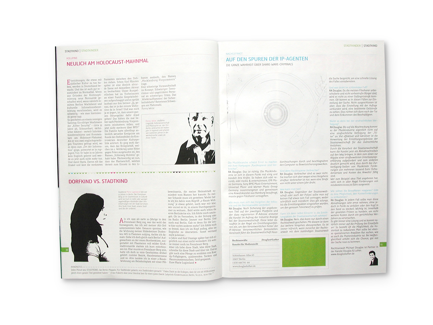
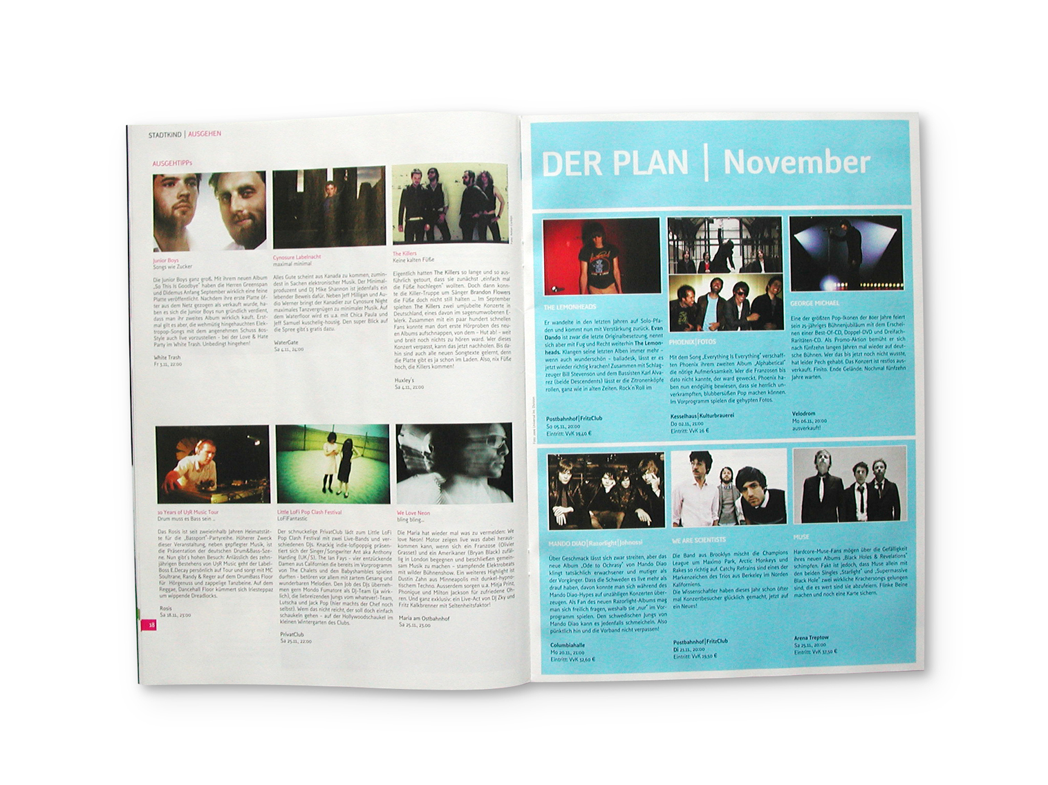
Es heißt »STADTKIND – Das Berlin-Magazin«, illustriert Geschichten und Nachrichten aus der großen Stadt und informiert über aktuelle Events, Partys etc..
Seit einigen Monaten sind wir auf der Farm damit beschäftigt, die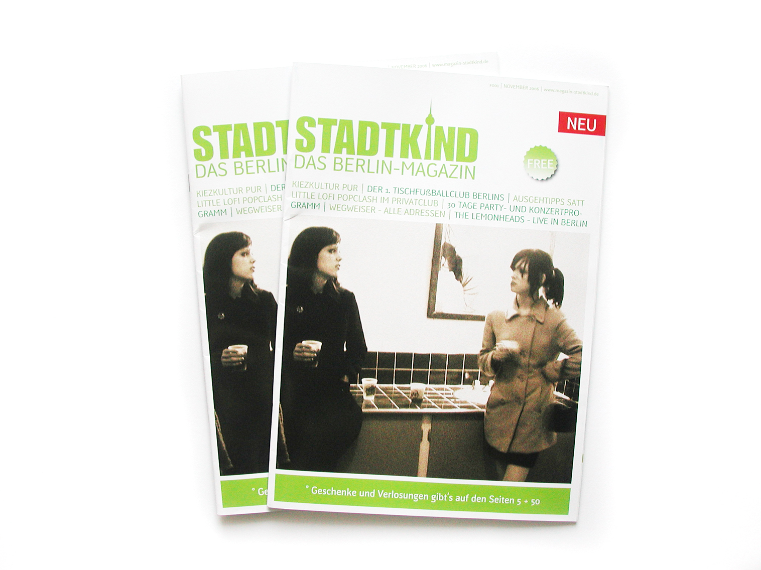
Offenbach
Aber so richtig gefreut haben wir uns (natürlich;) darüber, dass zwei Schriften von uns dabei sind:
Spatuim Magazin
Rezension von Jürgen Siebert (Fontblog)
Berlin/Köln
PAGE Online
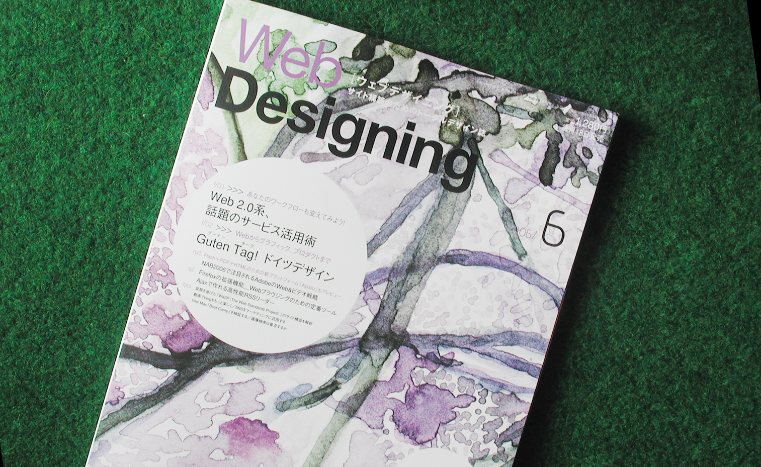
Japan, Tokyo
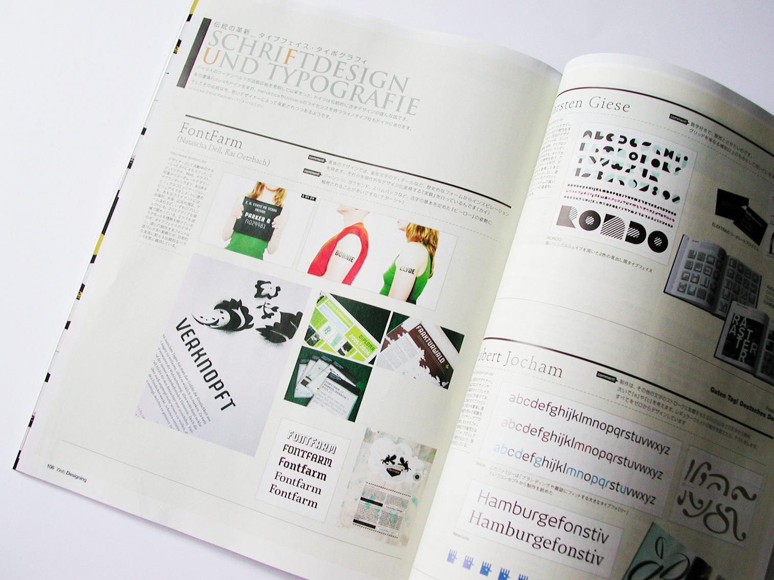
»Web Designing Magazine«
»Guten Tag! German Design – From web design to product design« 2006 is the year of Germany in Japan and many events related to Germany were held in all over the country. Moreover, we have FIFA WorldCup in Germany this June. The whole country has that Germany feel to it. Why not us? Well... Guten Tag! German Design. (Quotaion)
Chris Palmieri (AQworks) – a nice guy from Tokyo – interviewed us via mail and wrote a one-sided article abut the farm for this German-Design-Feature. Thank you Chris! »Web Designing« Homepage»AQworks«, Chris Palmierei & Eiko Nagase
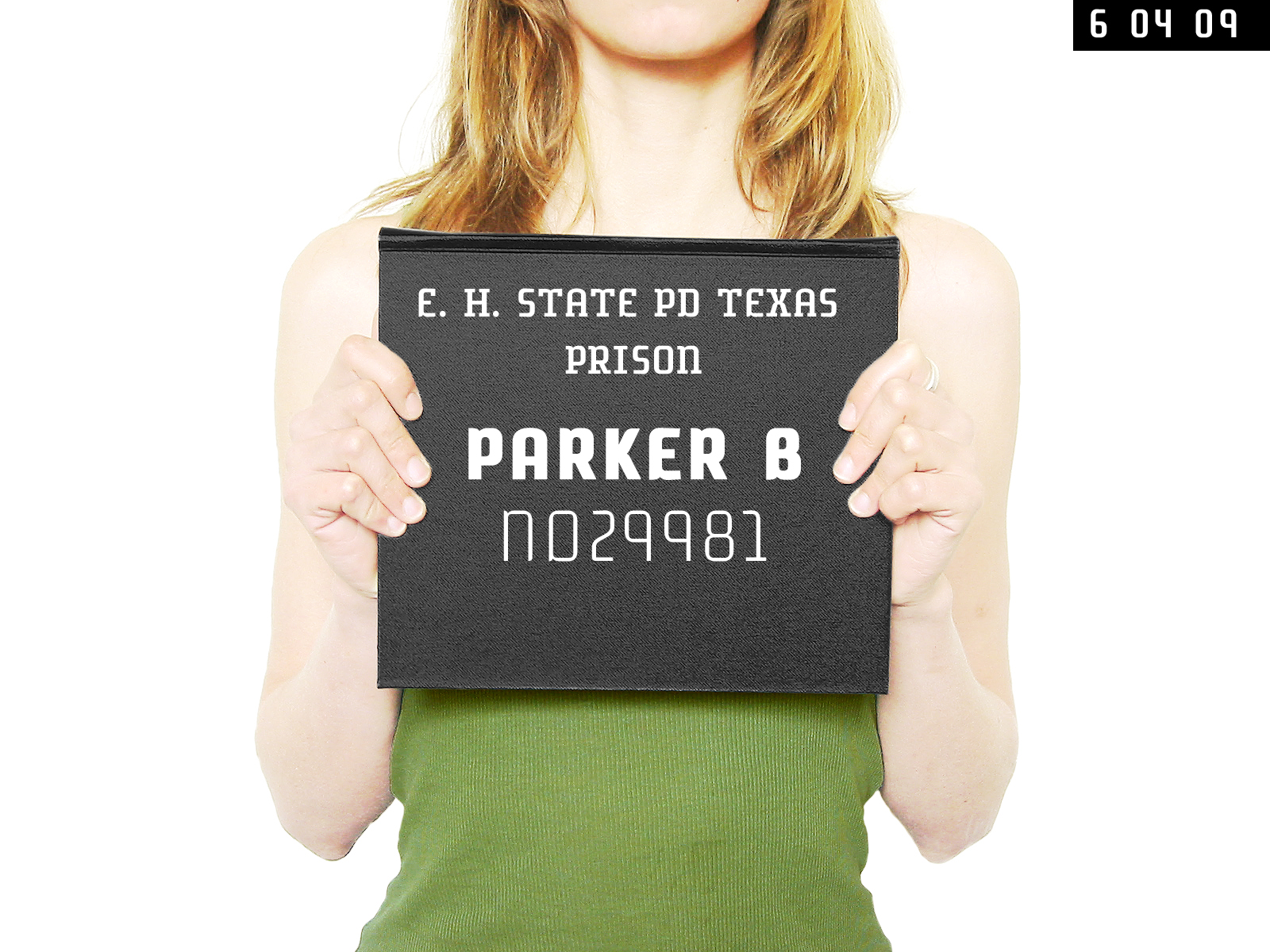
Aachen
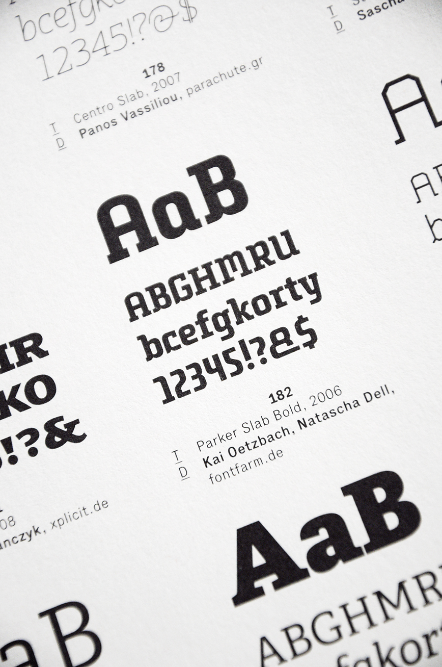
Release der Parker-Barrow
kürt die

Fachhochschule Dortmund
(Do., 19.01., 10:00). 33pt-Website
Aachen