Willkommen — Welcome
2016, April
Fontfarm.de, Velbert im Bergischen
New Website
Ten years after fontfarm was introduced to the public in 2006-January it was about time to change, rearrange, clean up the mess …

 
2015, October
Niggli Verlag, Karlsruhe
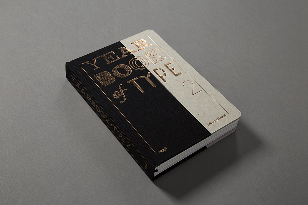
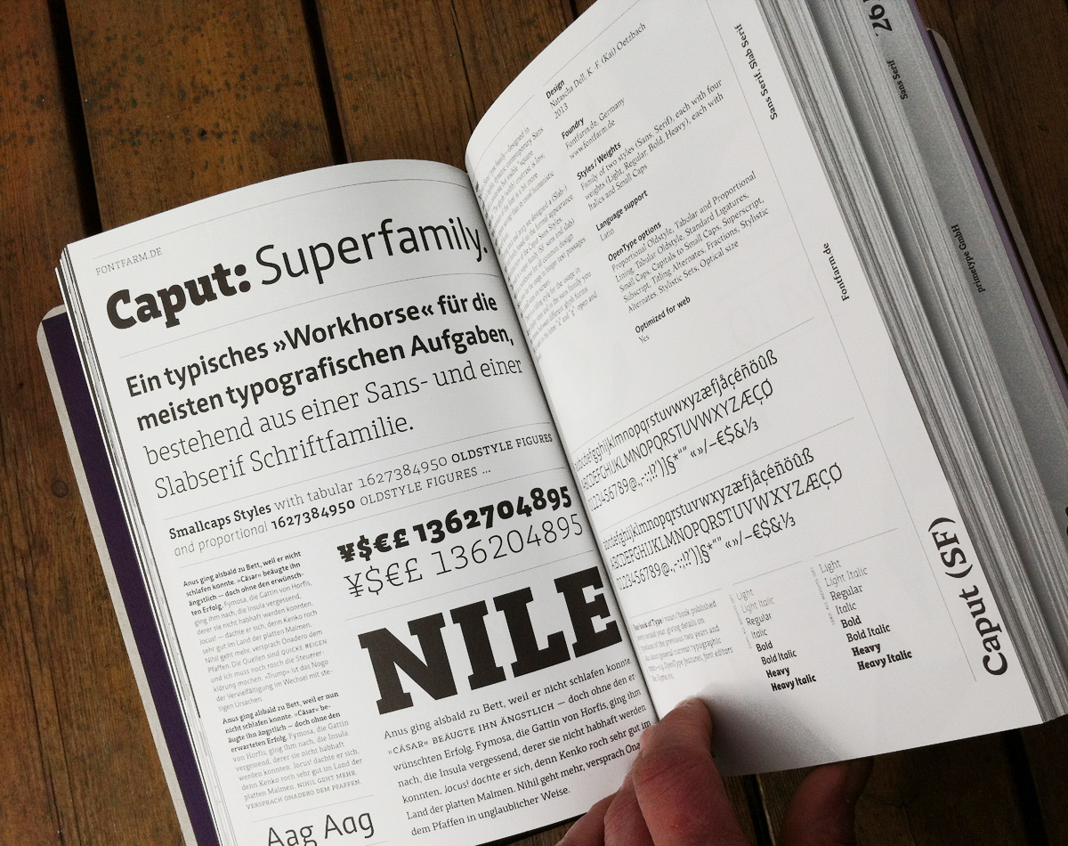
Yearbook of Type — II
»The constantly progressing digitalization of the media has radically altered the development and marketing of new typefaces. Desktop publishing and programs for the design of own fonts allow a previously unimaginable wealth of new typefaces. To provide an overview of this welcome diversity, the Yearbook of Type presents a selection of new releases from around the world – from large publishing houses to small, independent typographers and foundries.« (Quotation: Press-release)
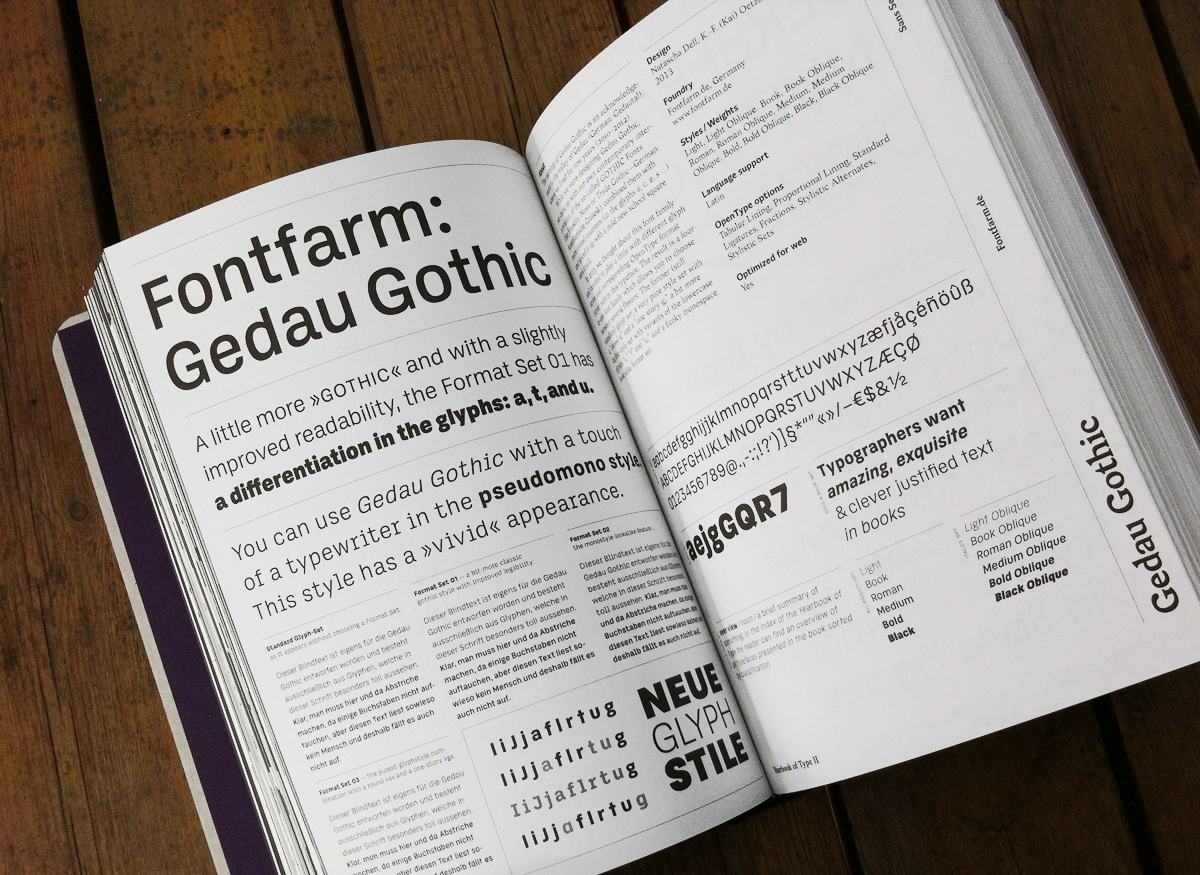
Fontfarm contributions: Caput Superfamily, Gedau Gothic.
Caput (SF)
Gedau Gothic
The Yearbook-Project on slanted ^


Bild oben: © SLANTED
2015, January
Verlag Hermann Schmidt Mainz
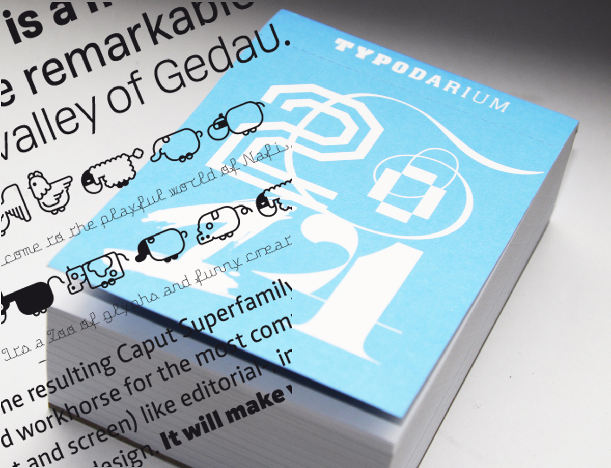
Typodarium 2015
Typodarium-Project ^
Hermann Schmidt Verlag, Mainz ^
Gedau Gothic
Fontfarm Contributions:
Pina Typesystem and Gedau Gothic Revisited
 
2014, October
Germany (Essen — Ruhrgebiet)
Gedau Gothic
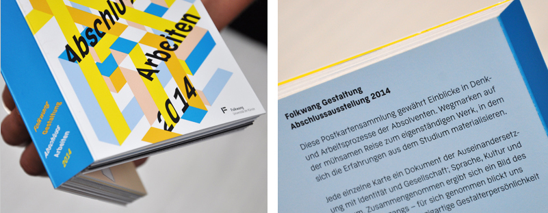
Form October: 09th to 13th/19th there was an exhibition of graduate projects at the Folkwang Universität der Künste in Essen.

We supported the visual communication of the exhibition by providing our Fontfamily Gedau Gothic for the promotional material.

Gedau Gothic
Folkwang Exhibition-Website ^
 
Gallery: 4 pics — Poster and Catalogue
2014, January
Verlag Hermann Schmidt Mainz
Contributions: »Typodarium 2014«
Typodaily, Dailytype, Typodare: In 2014 the Fontfarm.de is again part of the project with three of our typefaces: The already brandnew Caput (SF) Superfamily, the »oldshool« gothic-styled Gedau and Nafi, our »funny script and creatures« font.

The calendar was published mid-2013 (Hermann Schmidt Mainz) and it´s a great christmas gift for anyone who loves either type or tear-off calendars !!!

Fontfarm contributions: Gedau Gothic, Caput, Nafi.
Typodarium-Project ^
Hermann Schmidt Verlag, Mainz ^
Gedau Gothic
Caput
Nafi
Fontfarm Font Overview
2013, December
Velbert im Bergischen, Germany
Gedau Gothic Revisited
We had some thoughts on our fontfamily Gedau Gothic and decided to play a little with different glyph-styles and corresponding Open-Type-Format-Sets in this typeface.

The result is a four-in-one font-family, which allows you to choose between several flavors: The former (still standard) glyph-set; a very pure style-set with a »closed-a« and a »one-story-g«; a bit more legible style-set with variants of the lowercase glyphs »a«, »t« and »u«; and a funky-monospace-lookalike Format-Set.

For more information on the variable styles we recommend to visit the chapter Styles and Features in the Gedau Gothic section.
Gedau Gothic
 
2013, September
Velbert, Bergisches Land
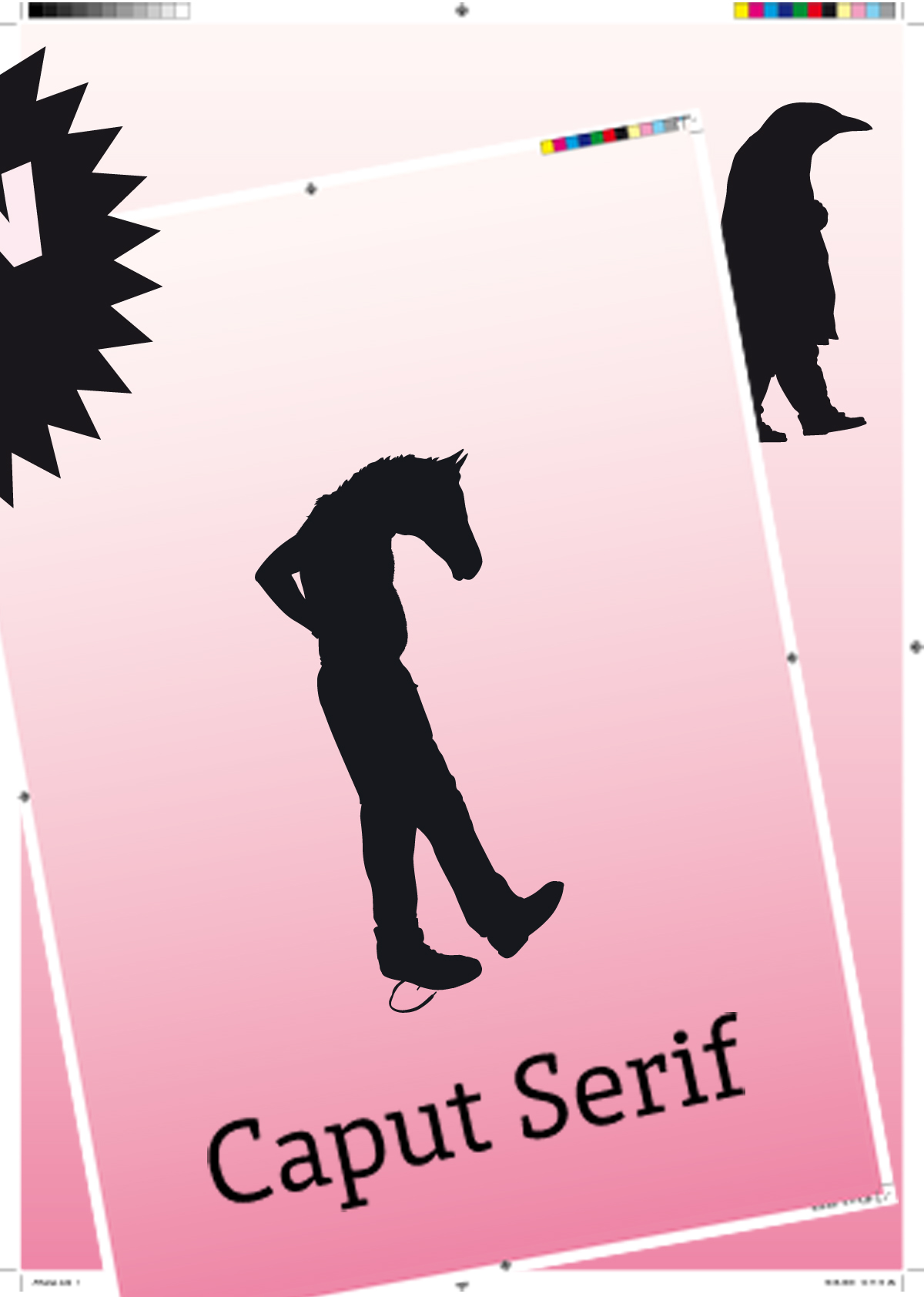
Caput Superfamily
The Caput Fontfamily — designed in 2008 — is a legible, dynamic contemporary Sans Serif with a moderate but visible »square character«.

During 2012 and 2013 we designed a new Serif Fontfamily, based on the formal appearance and architecture of the Caput Sans Styles. So now we have a brandnew Superfamily on the Farm called Caput (SF) which is a workhorse for all common design issues, even for the usage in long textpassages.

Caput (SF) comes up with the »old« Sans and the »new« Serif Family, each including eight »normal« and eight standalone Small Caps styles and with alternate glyphs (titling and letterform alternatives) and useful Opentype features (for more information take a look at »Type Talks« in the caput section).
There are many options for purchasing Caput (SF). Owners of the Fontfarm Package Caput Complete and owners of one of the the collections: Legible or The whole story can upgrade their Package/Collection to the Caput (SF) Complete Package with a large discount.
Caput
Fontfarm Font Overview
Fontfarm Font Collections
2013, June
Karlsruhe, Germany
Yearbook of Type I
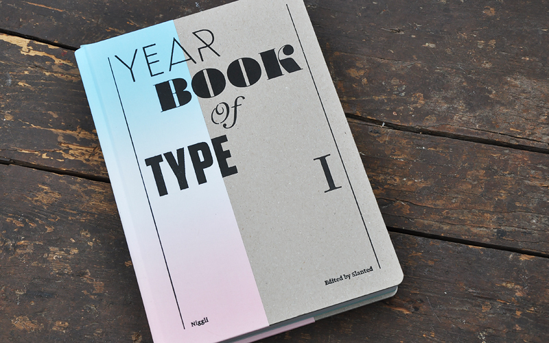
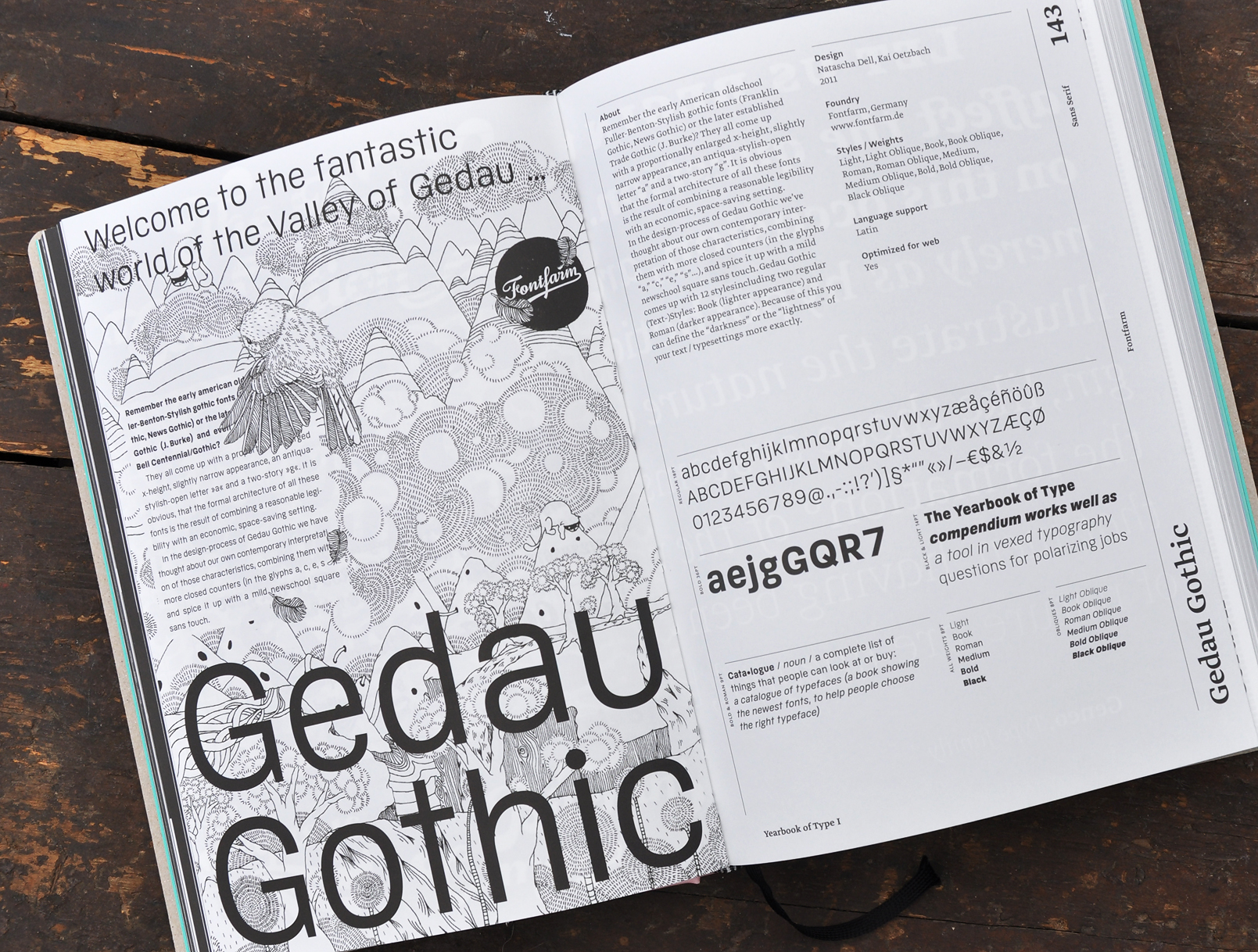
The »Yearbook of Type« (Niggli Verlag, Karlsruhe; edited by slanted) is an independent collection of fresh typefaces published during the past three years. It shows a hand-picked choice of fonts from larger to small(er) type foundries and from independent typographers.

Each typeface is presented on a double page with a »teaser« on the left and a small overview/description on the right side. More infos on the typographers and foundries are added in the last chapter of the book.

The fontfarm.de made three contributions in this fat compendium:
Gedau Gothic, Ergilo and Newtype
Fontfarm Font Overview
Ergilo
Newtype
Gedau Gothic
slanted.de ^
 
Gallery: 4 pics
There are more notes in our fontfarm history section …